
Introduction to Physical Geology |
Chapter 4 - Understanding Maps |
| Maps are useful for any profession, but they are particularly important to the natural sciences, especially geology. Geologic maps and topographic maps are perhaps the most important tools for evaluating landscapes for a host of issues involving land use, natural resources, and interpreting the geology both above and below the surface. Maps have been used well back into prehistoric times. However, the evolution of maps in the modern digital world has significantly changed map making—enhancing their use in nearly all aspects of modern science, technology, and culture. Modern maps are created with geographic information systems (GIS for short)—computer-based map-generating programs can combine geographic (spatial) information with many kinds of databases (medical, commercial, civic infrastructure, biological, geological, satellite data, etc.). Whether printed on paper or in a digital format, geologic maps are essential to understanding local and regional geology, including natural resources (minerals, water, soils) and natural hazards (earthquake faults, volcanic hazards, flooding and landslide hazards). |
Click on images for a larger view throughout this website. |
 |
|
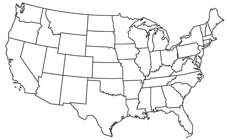
| Fig. 4-1. A blank line map of US is always useful! |
What is a map?A map is a diagrammatic representation of the land surface (or part of it), showing the geographical distributions, positions, and names of natural or artificial features such as roads, towns, relief, rainfall, etc. Maps are a scaled, 2 dimensional representation of the surface of an area or region. Some maps attempt to portray 3-dimensional landscape features, such as mountains or canyons. Maps may represent the surface of the land or regions in and around lakes and oceans, the seafloor, or features known or inferred to occur underground. Mapping is also used in astronomy (planet and moons, regions of space, etc.). There are many kinds of maps. Anything that has a visual distribution on the ground can be mapped.Prior to the modern digital world, maps were static sources of information, providing a glimpse of what existed in an area at the time that a map was compiled (example, a century old map of Washington DC is no longer accurate, but has historic value, Figure 4-2). In our modern world, maps can be updated with real-time information, but like all information, the data provided may have limited accuracy or scope, and may have bias to exaggerate or withhold selected information. |
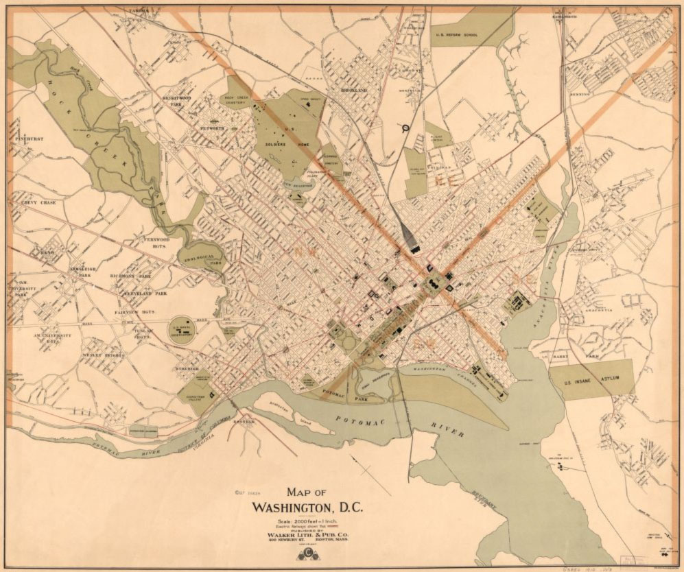 Fig. 4-2. Map of Washington, D.C.: Boston: Walker Lith. & Pub. Co., [1910?]. Library of Congress Photoarchive. |
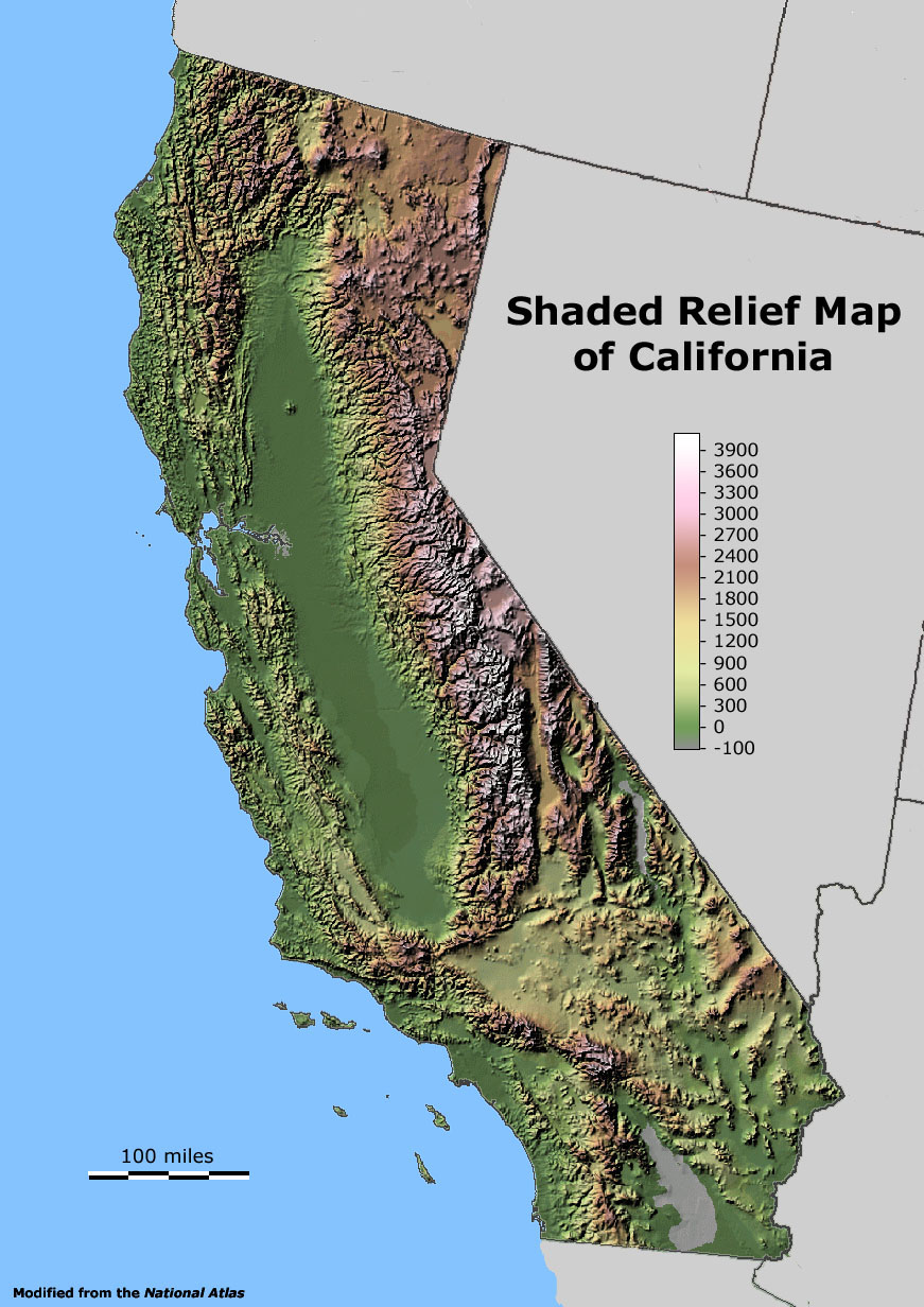
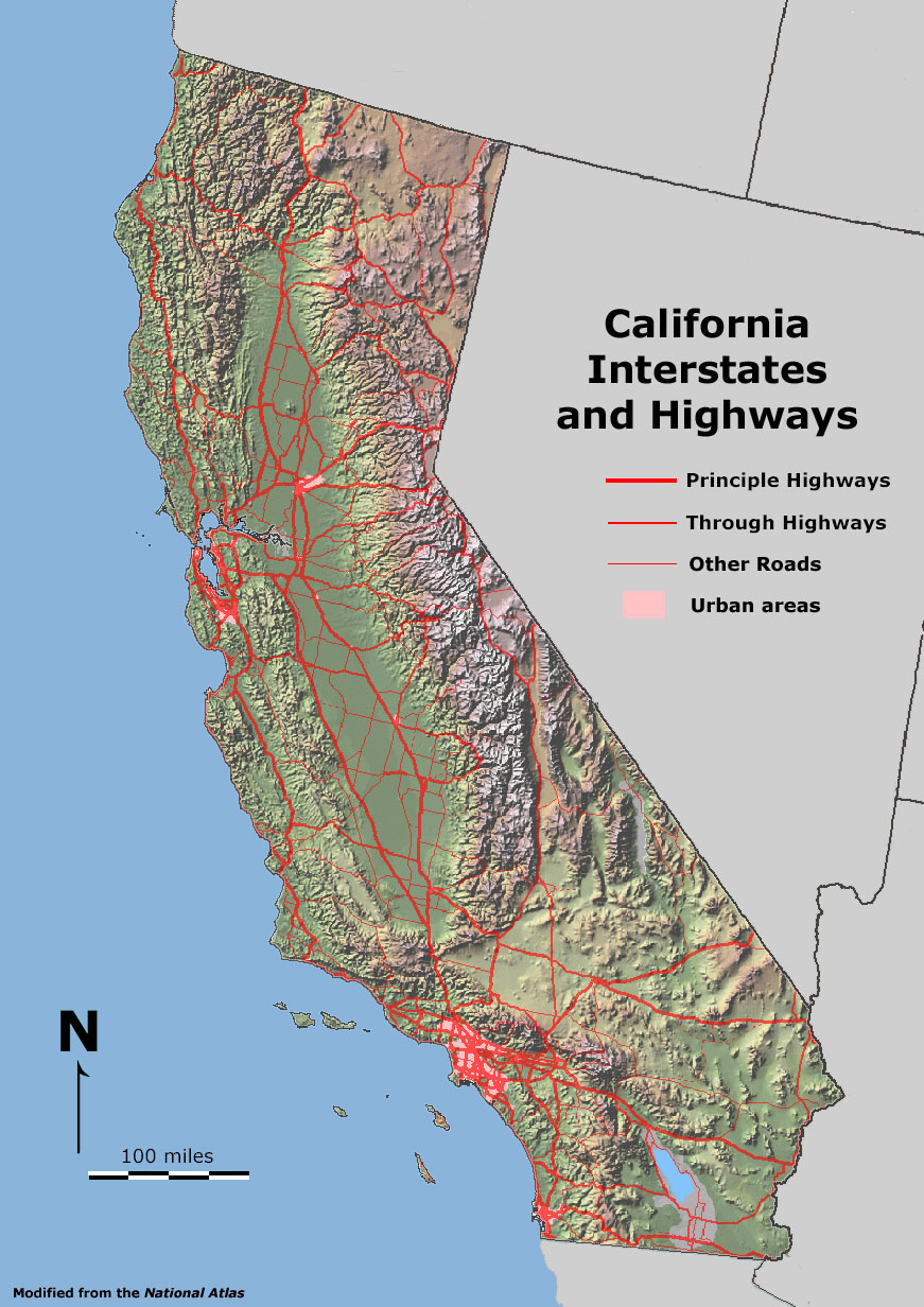
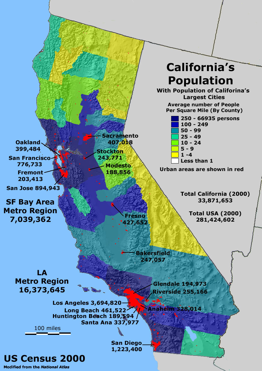
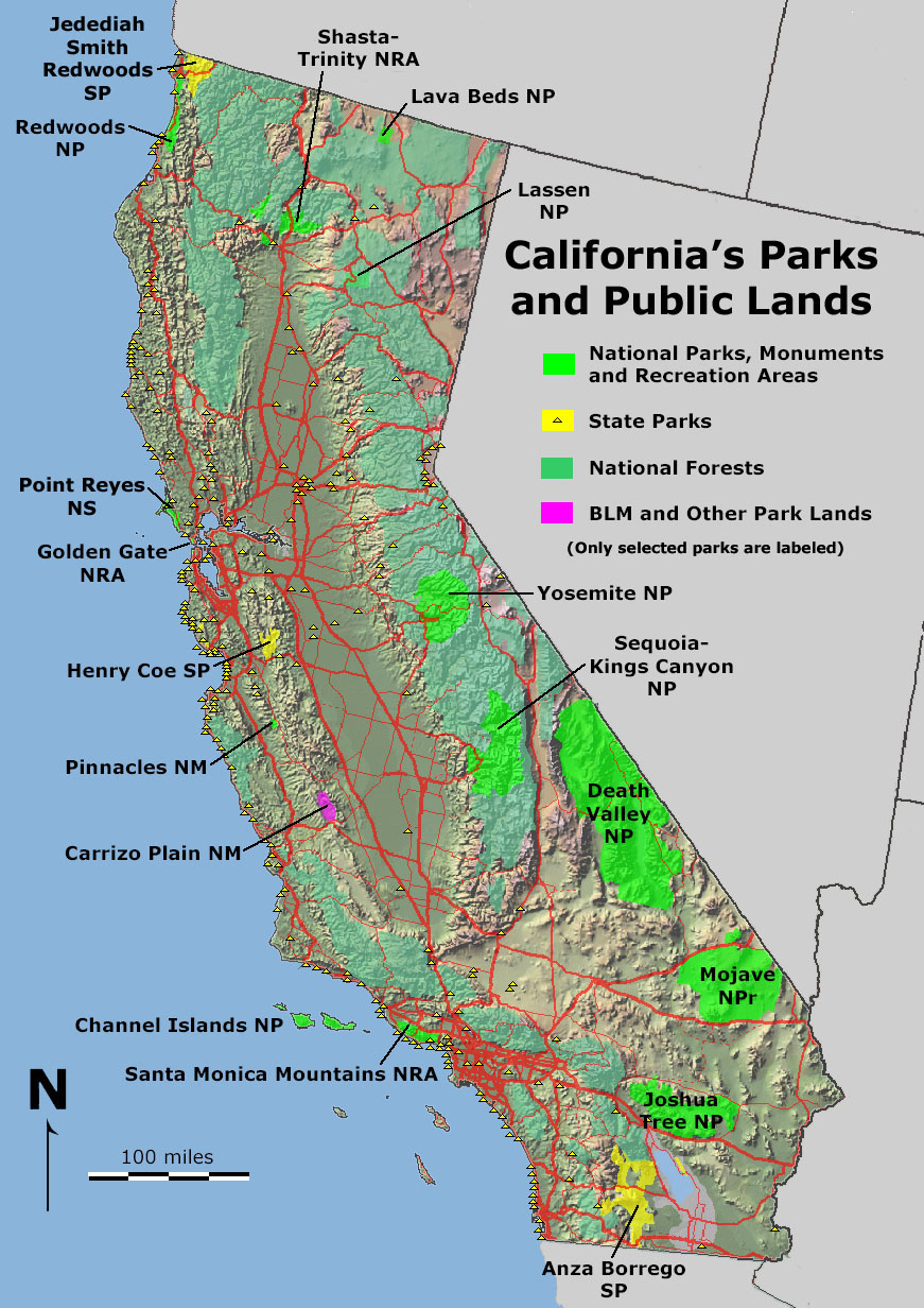
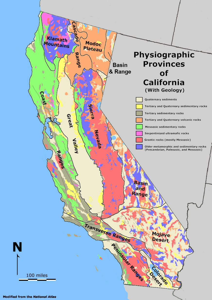
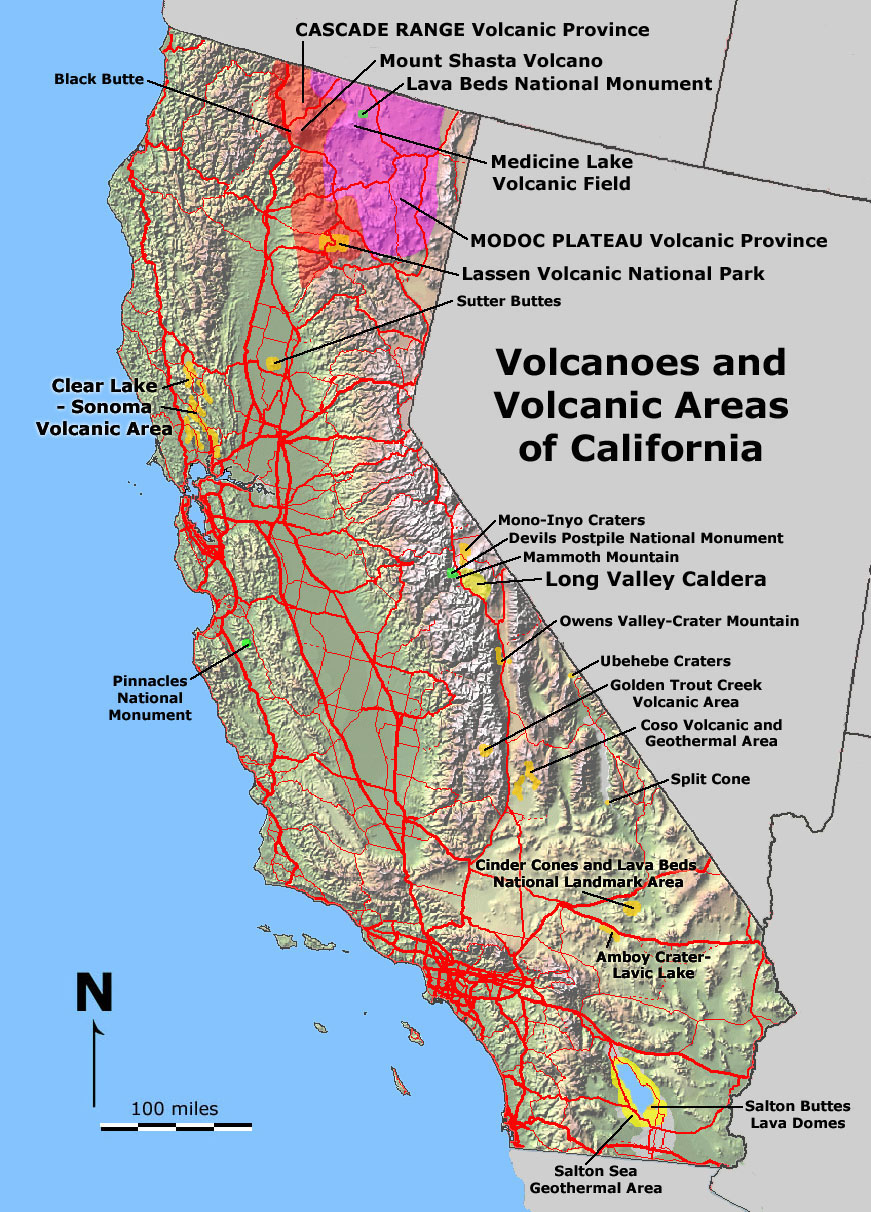
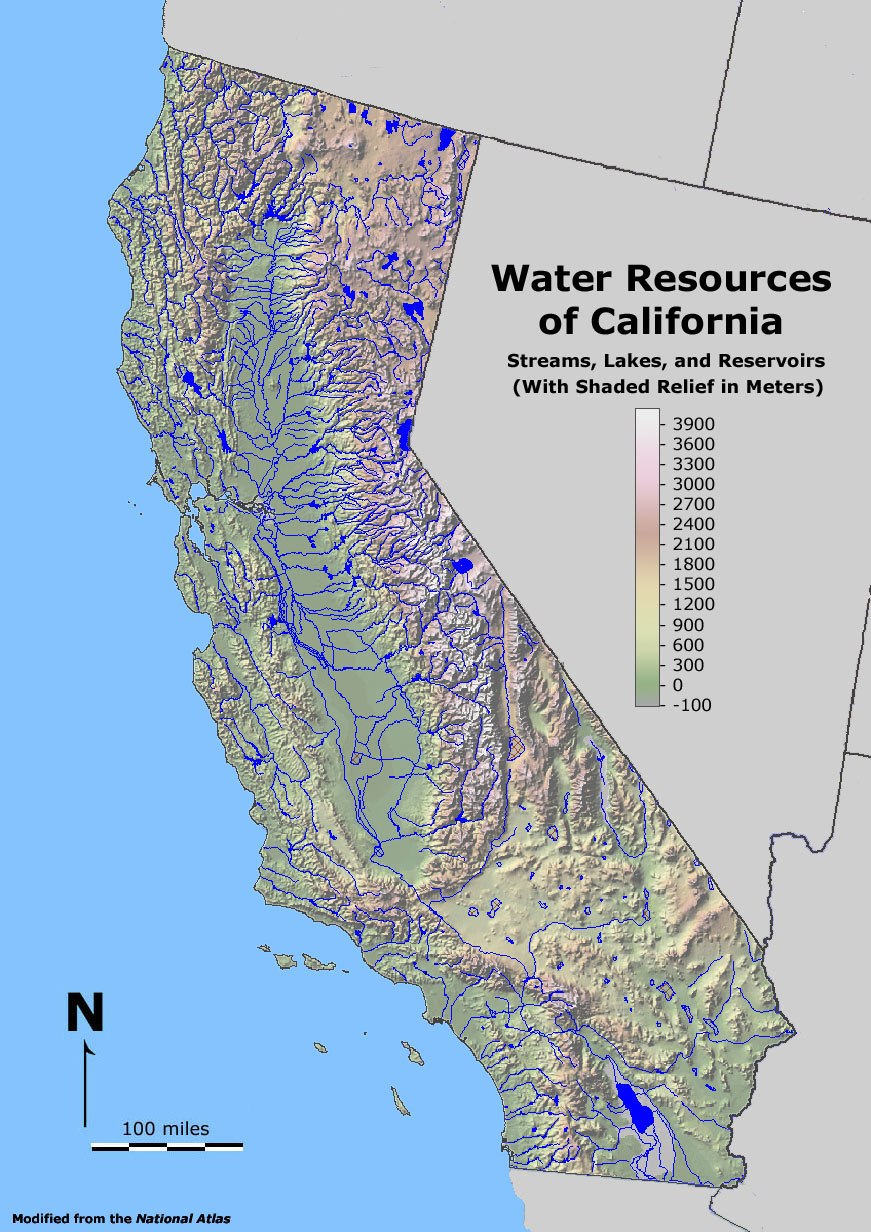
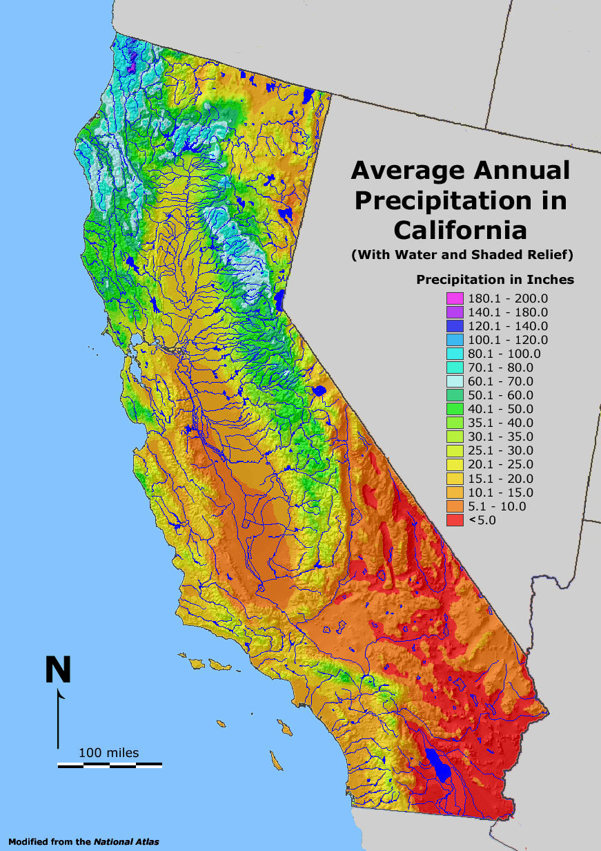
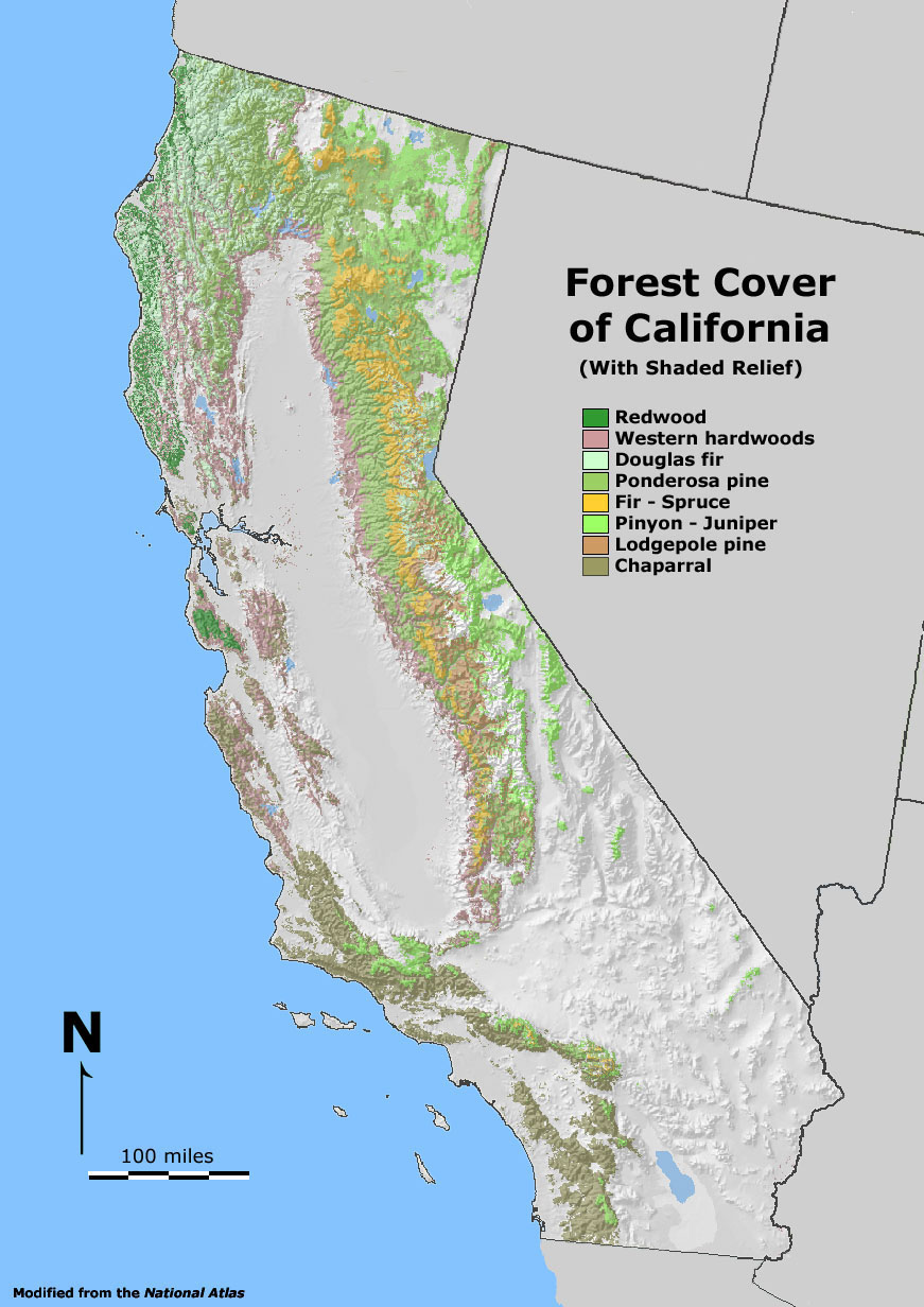
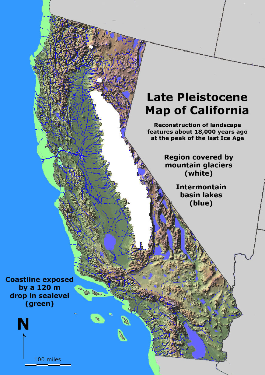
Thematic MapsA thematic map is is a map with a special theme applied to a geographic area. Themes can include physical geography, social, cultural, political, economics, land use, natural resources, hazards, or practically any data that can be presented geographic form, and on any scale, such as town, city, state, country, continent, or the world. Below are 12 examples of different thematic maps for the state of California (Figures 4-3 to 4-14). |
||||||||||||
Selected Thematic Maps of California |
||||||||||||
|


All Maps Should Include Descriptive InformationBefore studying or preparing a map, it is important to examine information about the map. Below is a list of information typically associated with maps. Some of these topics are examine in more detail is sections that follow.
|
Topography and BathymetryMany maps include information about the elevation differences on maps such feature as mountains, canyons, hills, shorelines, etc.● Topography refers to the arrangement of the natural and artificial physical features of an area. ● Bathymetry refers to the measurement or mapping of water depth (sea bed) beneath oceans, lakes, or other bodies of water. Relief is the variation in elevation on the surface of the Earth (topography). Areas of "high relief" have much elevation changes over distance, such as mountainous areas and canyons. "Low relief" occurs where elevation changes are minimal, such as on coastal plains (Figure 4-15). On maps, both topography and bathymetry are described as elevations relative the mean sea level in a region. Sea level is reported as 0 (zero) feet, meters, or fathoms (a fathom is 6 feet of water depth). Both topography and bathymetry can graphically illustrated with shaded relief or with contour lines. A shaded-relief map uses gray-scale shading giving the appearance of relief similar to sun shading (the way sunlights highlights a natural landscape—something that our brain automatically understands and processes!). A shaded-relief map can be used to illustrate both topography and bathymetry (Figure 4-16). Contour lines are another way to illustrate relief. Contour lines follow points of equal elevation and are spaced at uniform distances apart on a map. Examples of contour intervals might be 10 or 40 feet (or meters), depending on how much relief is in a map area. For example, contour lines can be illustrated by lines drawn on a stack of clear plastic box lids (Figure 4-17). Each lid represents a separate contour—a line of equal elevation. A topographic map is a graphical representation of a landscape showing selected natural and artificial landscape features including topographic relief. A topographic map shows many features including relief (contours) and man-made features of a portion of a land surface distinguished by portrayal of position, relation, size, shape, and elevation of the features (see example in Figure 4-18). The US Geological Survey produced topographic maps on many scales from the late 19th Century to the end of the 20th Century. Now, nearly all information is now in digital data provided by satellite information and other sources (discussed below). A map of the bathymetry of the ocean floor or large lake is called a chart. |
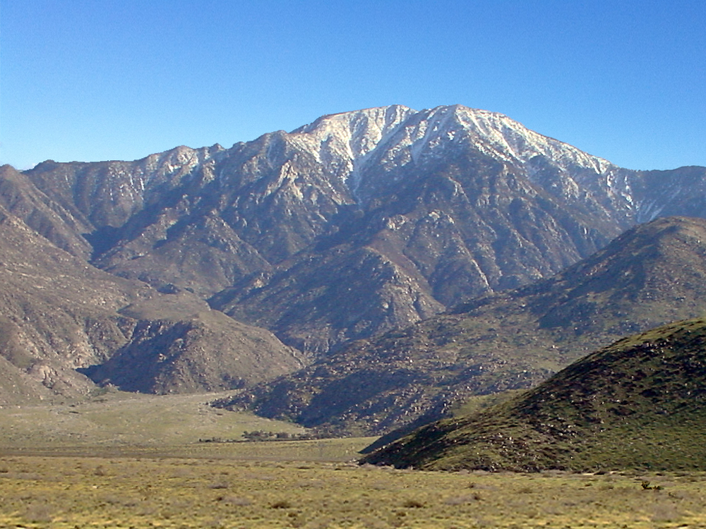 Fig. 4-15. A region of high relief is illustrated by this mountainous mountain face on San Jacinto Peak near Palm Springs, California. The alluvial fan in the valley below the peak is a region of low relief. 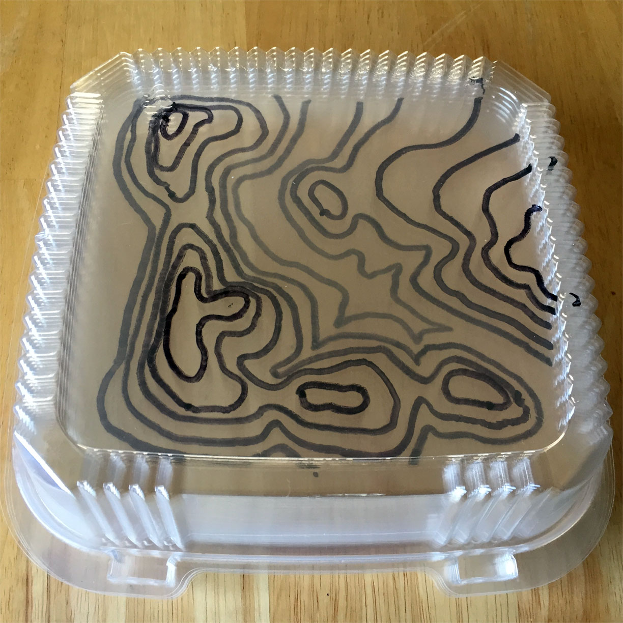 Fig. 4-17. Contours lines are lines that show levels of equal elevation. This figure illustrates contour lines drawn on on a series of a stack of six clear plastic box lids. Each lid has a separate contour line. This visually recreates three dimensional relief model as represented by contour lines on a topographic map. See examples of contour maps used to create similar sets of stacked box lids. Fig. 4-17. Contours lines are lines that show levels of equal elevation. This figure illustrates contour lines drawn on on a series of a stack of six clear plastic box lids. Each lid has a separate contour line. This visually recreates three dimensional relief model as represented by contour lines on a topographic map. See examples of contour maps used to create similar sets of stacked box lids. |
 Fig. 4-16. A shaded relief map of the central coast of California including Monterey Bay and San Francisco, CA. Both topography (on land) and bathymetry (undersea) are shown.  Fig. 4-18. Example of a USGS topographic map: Chittenden, CA 7.5 minute quadrangle. This map is an example of a map that the US Geological Survey produce for the United State for over 100 years before our modern map technology. |
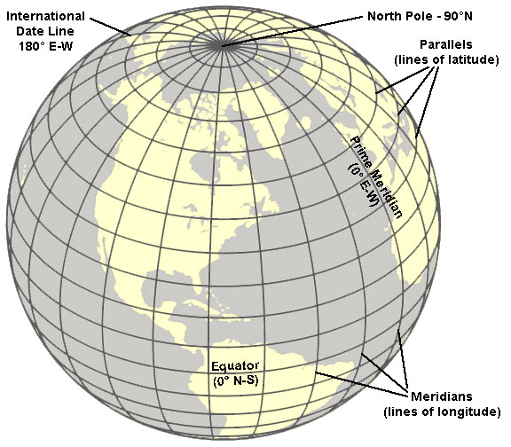
What are Latitude and Longitude?Locations on the Earth's surface are defined using latitude and longitude coordinate system.Latitude is a measure of the angular distance of a place north or south of the Earth's equator, usually expressed in degrees and minutes. Lines of latitude are called parallels. Latitude lines are parallel to the Equator. Each degree of latitude is approximately 69 miles (111 kilometers) apart (Figure 4-19).
Longitude is a measure of the angular distance of a place east or west of the Prime Meridian, and is also expressed in degrees and minutes. In order to make an accurate map of the stars for use in ship navigation, an important decision was made in 1884 to establish a longitude grid for Earth. A location indicating the precise location of 0° East-West longitude was designated in the cross hairs of a telescope in the Royal Observatory in Greenwich, England. (The Royal Observatory is located on the grounds of the National Maritime Museum in London). This Prime Meridian marks the north-south reference location used in all global mapping (including GPS location systems). A meridian is a circle of constant longitude passing through a given place on the Earth's surface and the terrestrial poles. Longitude lines (lines of equal spacing measured in degrees) are widely spaced at the equator, but converge at single points at both the North Pole and South Pole where all the meridians intersect (Figure 4-19). The Prime Meridian is designated 0° (zero degrees). Meridian lines east of the Prime Meridian are designated positive values (0° to 180° east); whereas meridian lines west of the Prime Meridian are designated negative values (-0° to -180°). At 180° east or west is the International Date Line. A degree of longitude is widest at the equator at 69.172 miles (111.321) and gradually shrinks to zero at the poles. At 40° north or south the distance between a degree of longitude is 53 miles (85 km). Defining locations with a latitude-longitude coordinate system—any location on the planet surface can be defined by a number in degrees and minutes north or south of the Equator and east or west of the Prime Meridian. For more detail, minutes are divided into seconds for more precise location with the longitude-latitude designation (compared with hours, minutes, and seconds on a clock!) |
|
Plotting Latitude and Longitude On a MapLatitude and longitude are reported in two ways: as standard coordinates or decimal degrees.Standard coordinates are the older method of using degrees, minutes, and seconds [DMS]). This method of reporting location was important before modern shipping navigation systems became available. Decimal degrees report latitude and longitude degree values using positive or negative numbers with decimal fractions (not minutes and seconds). Positive latitudes are north of the Equator, negative latitudes are south of the Equator. Likewise, positive longitudes are east of the Prime Meridian, and negative longitudes are west of the Prime Meridian. |
Example: Location of the Statue of Liberty in New York Harbor The standard coordinates of the Stature of Liberty are: Latitude: 40°68′92" N Longitude: 74°04′ 45" W Described in decimal degrees the coordinates of the Statue of Liberty are: Latitude: 40.689758° Longitude:-74.045138° Coordinated decimal degrees used by most modern GPS devices (on mobile phones) for of the Statue of Liberty are: Latitude: 40.689758° N Longitude: 74.045138° W |
 Fig. 4-23. The Statue of Liberty is a landmark located in New York Harbor between New York and New Jersey. |
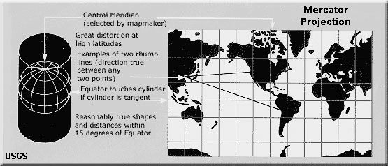
Map ProjectionsTrying to make a flat map of a round planet is like trying to fit a square peg in a round hole. Noting fits perfectly.The Earth is round (a sphere like a globe) but paper maps are flat. As a result, maps that show large regions are distorted. Map projections are attempts to portray a portion of the earth on a flat surface. The flattening of a map always causes some distortions of distance, direction, scale, and area. Large scale maps (such as a map of a continent or a world show much distortion. In contrast, maps on small scales (such as a map of a town or neighborhood) have relatively little distortion. The Mercator Projection is perhaps the most widely used in flat-map publications (Figure 4-21).
|
| The Mercator map in Figure 4-24 is an example of a general Mercator map for pin-pointing latitude and longitude. Below are examples of the GPS location of points representing major cities as reported on a Google search for coordinates. Note that these reported coordinates are subjectively reported -- because cities are large areas, covering hundreds of square miles. It is unclear what these points may represent in each of the cities listed below. Compare these coordinates with the map in Figure 4-24. Note that these locations listed below are the coordinated GPS decimal degrees reporting method.
|
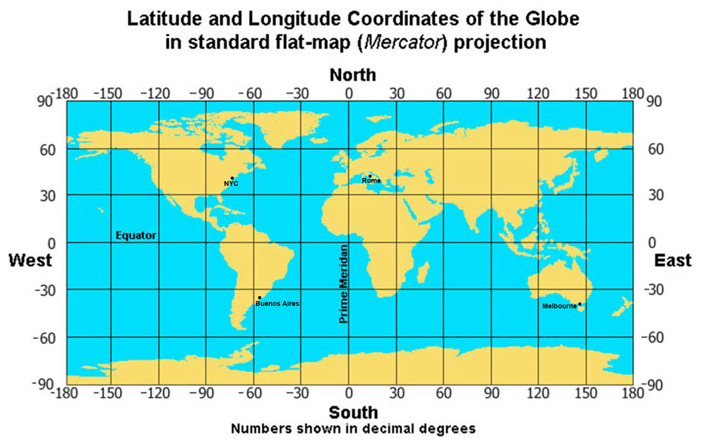 Fig. 4-24. Map of the world showing latitude and longitude in a Mercator (flat) projection with numbers illustrated in decimal degrees. |
The Global Positioning SystemA Global Position System (GPS) is a system of Earth-orbiting satellites synced with computers and universal atomic time clocks that send information to receivers, such as a cell phone, car, or hand-held GPS. GPS devices are capable of measuring precise latitude, longitude, and elevation of a receiver anywhere on Earth. Locations are calculated by comparing the time delay for signals to reach a ground-based receiver from different satellites. Real-time calculations can provide precise determinations of the location of the receiver. Most modern mobile telephones have GPS connectivity.The GPS system was developed, funded, and is controlled by the U.S. Department of Defense. The GPS system was made public in 1995 and has undergone extensive development with at least two-dozen satellites, and is currently used for thousands of civilian applications worldwide. Real-time GPS is used for navigation to determine exact location, velocity, and time anywhere around the world. GPS provides reliable location and time information in all weather conditions and at all times, anywhere on or near the Earth when and where there is an unobstructed line of sight to four or more GPS satellites. |
 Fig. 4-25. The Global Positioning System (GPS) of satellites orbiting Earth. |
Earth's Rotation Influences It ShapeFrom space, Earth may look like a perfect sphere; however, detailed measurements show that the planet is not a perfect sphere. Earth's rotation impacts the shape of the Earth. The circumference of Earth at the Equator is 24,902 miles (40,075 km, or 21,639 nautical miles). In contrast, the meridional circumference ( longitude lines following the great circles that converge at the poles) is only 24,860 miles around (or 40,008 km or 21,603 nautical miles). This is because the Earth is spinning—this rotation causes the Earth to expand at the equator, and flattens at the poles. Because of the spinning, Earth is actually an oblate spheroid, not a perfect sphere. At the poles, there is rotation, but no motion. In contrast, at the Equator, the Earth surface is moving about 1,000 miles per hour (460 meters per second) toward the east. This difference in physical motion between the poles and equator is responsible for dynamic rotation forces, called the Coriolis effect. The Coriolis effect is responsible for the observable rotation in currents driving oceanic and atmospheric systems, including atmospheric rotation in hurricanes (discussed with relevant topics in following chapters, Figure 4-26). |
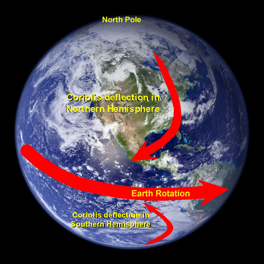 Fig. 4-26. Earth's spin influences the shape of the planet and causes the Coriolis effect. |
Important Historical Mapping In the United StatesAs the United States expanded westward across North America into new territories, the Federal government developed the Public Land Survey System (PLSS) to chart out the country to subdivide the landscape into rectangular boundaries to establish property boundaries, access routes, and provide a system for naming and locating precise locations on the ground.While the PLSS worked for subdividing the land, the problem of trying to map and subdivide the land into squares on a curved land surface presented many problems, especially for mapping the nation as a whole. A new method of mapping used by the US Geological Survey involved subdividing regions to be mapped into quadrangles—using latitude and longitude designations for map boundaries (discussed below). |
The Public Land Survey SystemHistorically, as the United States expanded its territories in the 18th to early 20th centuries, land was surveyed (mapped) and subdivided using the Public Land Survey System (Figure 4-27). The first use of the PLSS began in Ohio in 1785. The PLSS is still used for all lands in the public domain, and is currently regulated by the Bureau of Land Management (a branch of the U.S Department of Interior).This method of surveying involved measuring a grid of lines east-to-west and north-to-south starting with a designated initial point (such as a mountain peak like Mt. Diablo in central California). From an established initial point, a north-to-south was mapped (called the principal meridian). From the initial point, a baseline was mapped east-to-west following a line of latitude. See examples of the initial point, principal meridian, and baseline for the Nebraska Territory Survey in Figures 4-28 and 4-29. North-south lines are called township lines and east-west lines are called range lines (Figure 4-30). These lines of a grid are parallel mapped at intervals of at 1 mile apart. Flying over the country today it is easy to see the historical significance of the township and range lines because they are the locations of roads and property boundaries throughout the landscape we see today. The geographic term, township, is often square region of land that encompasses 36 square miles as defined by township and range lines (Figure 4-30). One square mile of land within a township is called a section. There are 36 section in one township. Each section is number in a consistent pattern, and sections may subdivided into quarters (labeled NE, SE, SW, NW) and these quarters may be subdivided into quarters, and so on (see Figure 4-30). On a limited regional scale, township and range lines work fairly well, but with increasing distances the rectangular pattern begins to fail due to distortion caused by the curvature of the Earth surface. To solve the distortion problem, new grids with township and range lines were set up throughout the country over time. The Public Land Survey System is used for describing locations where the land grid has been establish. Throughout much of the United States, particularly in western states, roads (commonly dirt tracks) follow section lines east and west, and north and south. These lines are considered public access routes in most states, and are a means of finding and locating specific pieces of property or locations on public lands. |
 Fig. 4-27. Principal Meridians and Base Lines of region that used the Public Land Survey System (map provided from US BLM). |
 Fig. 4-28. Detail view of a public land survey of Nebraska Territory showing the initial point, principal meridian, and baseline. |
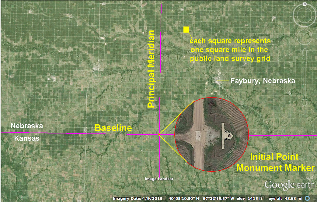 Fig. 4-29. Google satellite image views of the initial point for the Public Land Survey of Nebraska Territory started in 1855. |
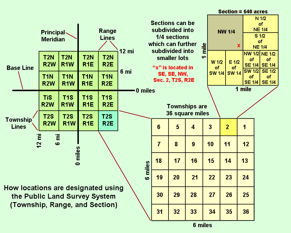 Fig. 4-30. Locations in areas mapped with the Public Land Survey System are designated by township, range, and section. |
USGS Topographic MapsThe US Geological Survey was established in 1879, and then the US Congress approved topographic mapping of the United States in 1882. For well over 130 years, the USGS conducted topographic mapping across the United States and its territories. This colossal endeavor required map standards (designations of common symbols, scale, contours, etc.) that had to be consistently used for mapping by thousands of mappers over time. Initially, all mapping was done on a scale of 1:48,000 for maps that covered 15 minute quadrangles—maps covering 15 minutes (or 1/4 degree) of latitude and longitude on each side. Later it changed to the 7.5 minute quadrangle standard (with 1:24,000 scale) so as to provide more detail of coverage. In addition, the USGS also provided maps on greater scales (30 x 60 minute maps with 1:100,000 scale, and 1 x 2 degree maps with 1:250,000 scale).Figure 4-31 is a standard map index for 30 x 60 minute quadrangles for the state of California. Figure 4-32 is a portion of the USGS Topographic Map Index showing the names of 7.5 minute quadrangles. Note that the block highlighted in yellow represents 32 named 7.5 minute subdivisions of one of the quads shown in the 30 x 60 minute map index. [Note that quad is a common abbreviation for quadrangle.] |
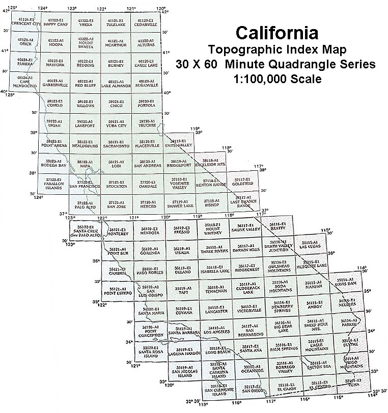 Fig. 4-31. California Map Index for USGS 30 x 60 minute quadrangle designations. (Equals 0.5º latitude and 1.0º longitude on each side of quadrangle map.) |
 Fig. 4-32. Portion of the California USGS Topographic Map Index showing map 7.5 minute quadrangle designations. |
| Before modern digital mapping, standard USGS topographic maps were 7.5 minute quadrangles with scale of 1:24,000. The standard USGS 7.5 minute quadrangle map is slightly skewed rectangular-shape representing an area approximately 17 miles (27 km) north to south and within the lower 48 states range from 11 to 15 miles (17 to 24 km) east to west. There are dozens of different kind of symbols used on topographic maps. See a complete list of US Geological Survey Topographic Map Symbols is at: http://pubs.usgs.gov/gip/ TopographicMapSymbols/topomapsymbols.pdf |
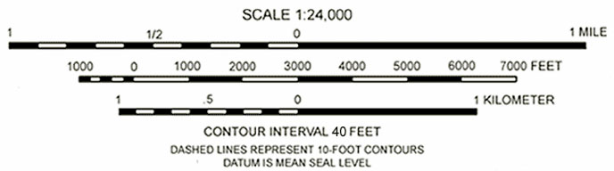 Fig. 4-33. Scale bar on a typical 1:24,000 topographic map (standard USGS 7.5 minute quadrangle maps). |
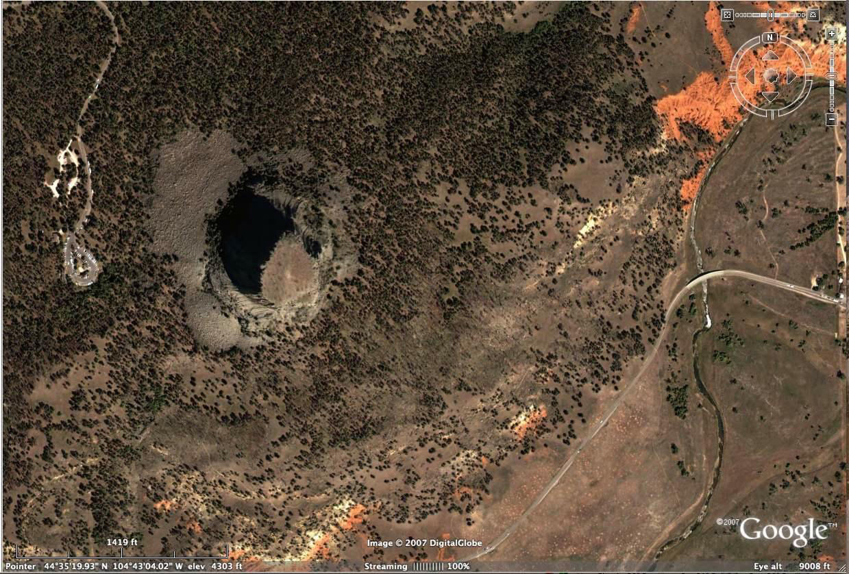 Fig. 4-34. Google satellite view of Devils Tower, Wyoming. Compare this image with a 7.5 minute quadrangle coverage of the same are in Figure 4-34. |
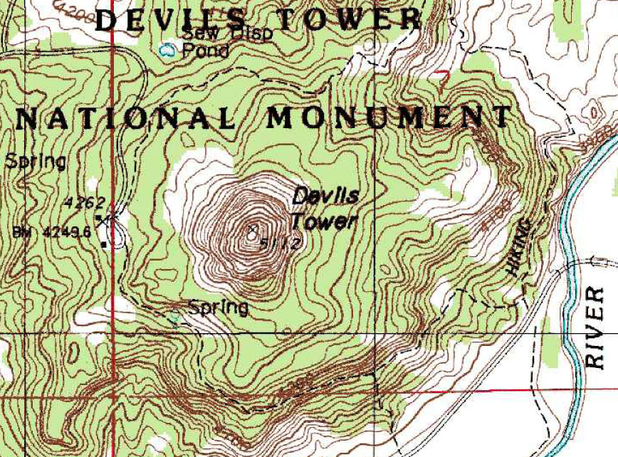 Fig. 4-35. Part of Devils Tower 7.5 Minute Quadrangle Map, Wyoming showing contour lines, green for wooded areas, elevation markers, etc. |
| On a standard USGS 7.5 minute quadrangle map, one inch on the map is equal to 2,000 feet on the land surface. |
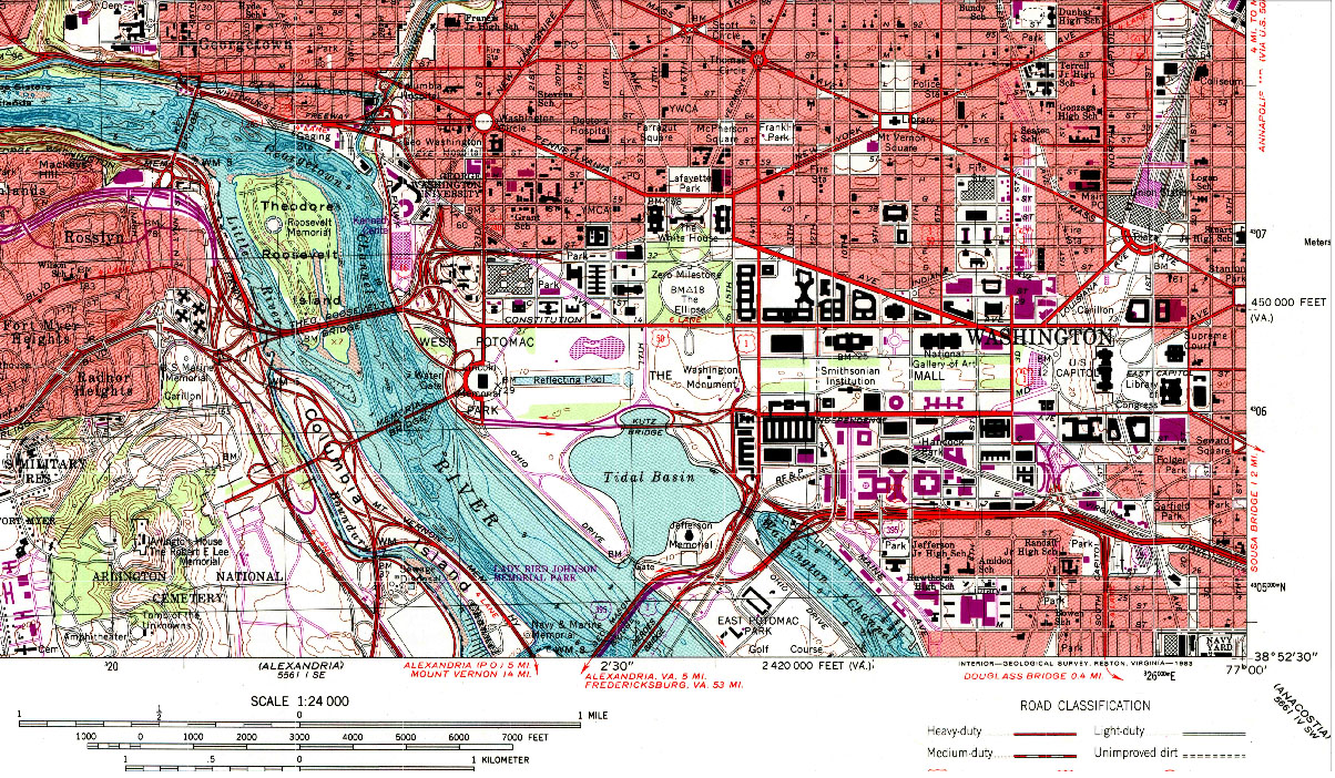
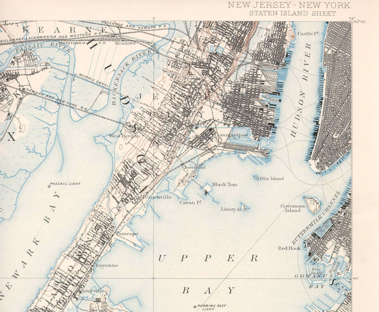
Examples of Topographic MapsBelow are 4 examples of historic USGS quadrangle maps. Figure 4-36 shows the original mapping conducted in 1903 on the 15 minute quadrangle scale, Figure 4-37 shows mapping of La Jolla, California in 1967 on the 7.5 minute quadrangle scale. Figures 4-38 and 4-39 show famous location, Washington, DC (US Capitol area, 1968) and New York Harbor (1891). |
||||
|
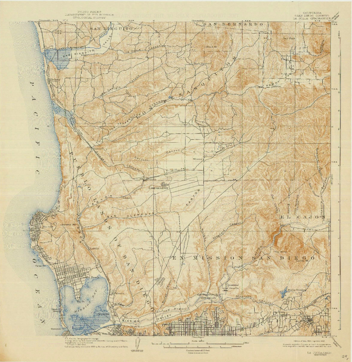
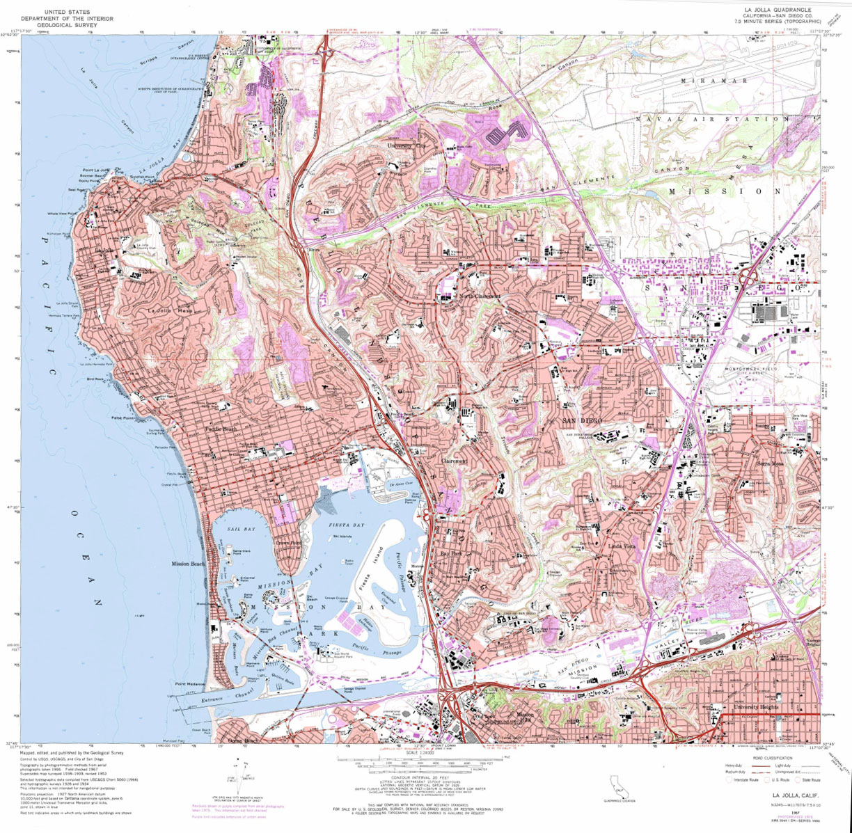
Maps Evolved in the Digital EraIn the world of mapping, everything has change. It the days before computers, the mapping of an area of a single topographic 7.5 minute quadrangle took a crew of men (women weren't allowed!) several months to map, and the quality of the work was hindered by rough terrain, bad weather, and often, alcohol and other disputes among men. Despite the problem, the country was mapped, and urban areas were often remapped over-and-over as development progressed. Starting in the 1980s and especially in the 1990s, new methods of mapping evolved that relied on converting imagery from satellites and air-born photography and radar that could create digital geographic data in an instant that would have previously taken months or years, with much more reliable accuracy. It is important to emphasize that the old maps still remain incredibly important! Old maps preserve the history of a region, giving us a glimpse of how the landscape has changes (Figures 4-36 and 4-37 illustrate this for La Jolla, California). It is extremely important for future generations to preserve a history of land use for many reasons, particularly related to environmental health and quality, such as related to water quality issues, location of hazardous waste sites, landfills, and geologic hazard mitigation. |
Geographic Information Systems (GIS)Geographic Information Systems have, arguably, been one of the most important applications of computer technology of our modern era. Maps, and particularly map data provide essential information to nearly all decision making in politics, military, business, agriculture, and social and physical sciences! A GIS (geographic Information system) is a computer application used for capturing, storing, editing, and displaying data related to locations or areas on Earth’s surface. GIS can show many different kinds of data as viewable layers that can be merged on one map, showing features such as streets, streams and lakes, buildings, vegetation, political boundaries, demographic data, and geologic maps. GIS makes it easy to see, analyze, and understand patterns and relationships on a landscape (Figure 4-40).Two important aspects of modern mapping related to: 1) raw data, and 2) interpretation data. Raw data is data directly taken from a sensor, such a special type of video camera or radar antenna on a satellite. Raw data include aerial photography, satellite imagery, radar images, or other special sensors able to detect different wavelengths of electromagnetic radiation (such as microwaves, infrared rays, or Xrays), or subatomic radiation. This data can now be processed in real-time and projected in referenced with GPS position data. Old maps, elevation data, and aerial photographic imagery have been digitized and converted into data that can be incorporated as layers in a database for geographic information systems. Interpretation data is data that comes from other information collection methods. Classic examples include database collections of census data, business sales and financial data, disease and health data, biological resource data, weather and climate data, earthquake data, transportation data... the list can go on and on! Unfortunately, interpretation data can be very subjective, often incomplete, and easily misinterpreted. |
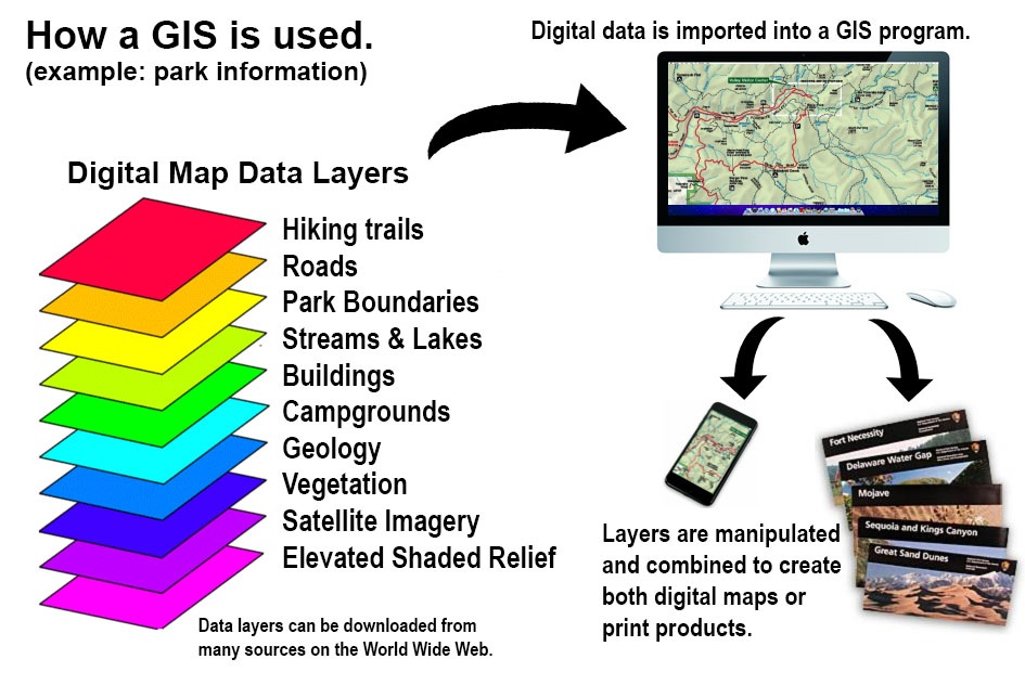 Fig. 4-40. How GIS is used to create maps from raw and interpreted data downloaded from the World Wide Web. |
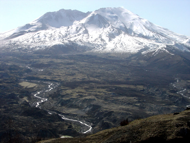
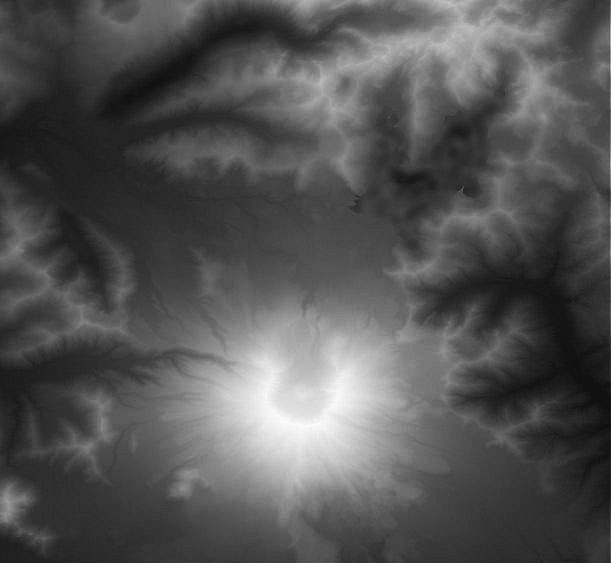
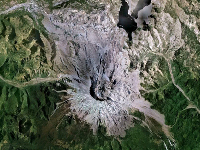
Examples of GIS Projections of Using Map DataDEMs and DOQs are commonly used types of digital map data that show topography natural landscape features, and can integrated into geographic information systems (GIS).A digital elevation model (DEM) is a raw representation of ground surface topography or terrain (elevation). For example, Figure 4-42 is a DEM of Mount St. Helens area. DEM data is commonly used as a base map in a geographic information systems (GIS). DEMs are created from historic topographic map contour data, or possibly more accurately, from airborne radar data. Each pixel of a computer-generated image using DEM data is assigned with elevation information that can be generate 3-dimensional map view. A DEM can be used for the generation of contours, shaded relief maps, 3-dimensional terrain models. and elevation profiles for cross sections combined with other data. A shaded relief map is a map of an area whose relief is made to appear three-dimensions using gray-scale shading based on a hypothetical sun angle—such as on a typical late afternoon. Sunshading on a relief map gives a natural appearance that the human eyes and brains can easily interpret. For example in Figure 4-43, sunshading on a digital map of Mount St. Helens makes north and east facing slopes appear darker than south and west facing slopes. A digital orthoquad (DOQ) is an aerial view a map generated from raw satellite imagery or photography taken from an aircraft that has been digitally rectified to match a latitude-longitude grid associated with a standardize map grid, such as a USGS 7.5 minute quadrangle. Figure 4-44 is an example of DOQ imagery for Mount St. Helens. Satellite imagery associated with Google Maps and other similar platforms are examples of digital orthoquad data. |
||||
|

The Digital-Dominated Map WorldAlthough there are many map information resources available through the World Wide Web, the mapping platforms provided by Google.com are perhaps the most widely used, and for many good reasons. In addition to their own resources, Google has made map data, databases, and intellectual content available in collaboration with many organizations (government and private), and Google provides a digital platform and public access to a multitude of map-related resources. The National Map is a suite of USGS map products and services that provide access to base geospatial information to describe the landscape of the United States and its territories. The National Map embodies 11 primary products and services and numerous applications (including topographic and shade relief maps, water, political boundaries, and regional features, and much more. The map can be manipulated to a variety of scales (very small to very large), but the focus of most map data is on the standard medium 1:24,000 scale maps and data. |
 Fig. 4-45. Click on this image to go to the Google Earth information and application download website or use the website: https://earth.google.com/. 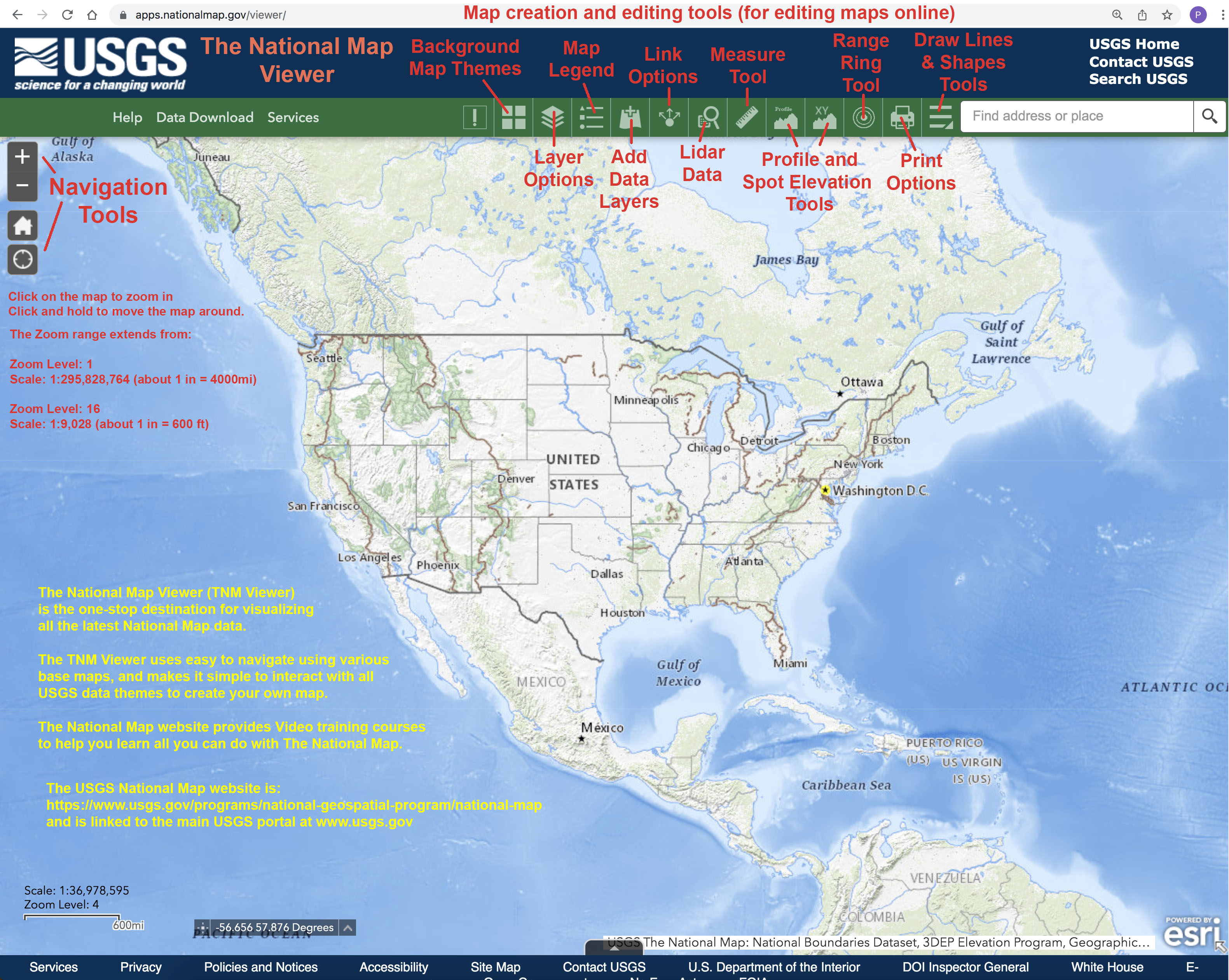 Fig. 4-46. The National Map Viewer - Make maps using USGS base maps and data layers. Fig. 4-46. The National Map Viewer - Make maps using USGS base maps and data layers. |
KML Files for Google EarthMany organizations have compiled data for easy import and viewing in Google Earth. The data is in the format of a KML file—a .kml file is geographic information stored in a file format that can be imported into an Earth browser, like Google Earth. KML joins geographic information, (nested elements, such as points, lines, polygons, or 3-dimentional forms) with descriptive information an attributes that allow information to be overlain on the base imagery or maps provided by an Earth browser. Examples of data stored in KML include earthquake and fault information, roads, buildings, flood and fire information, distribution of disease cases, political data—or just about anything that can be visualize on a landscape. KML files can be downloaded from websites and imported into Google Earth. Google Earth provides many data sets (see examples the menu list on the left side of Figure 4-47). |
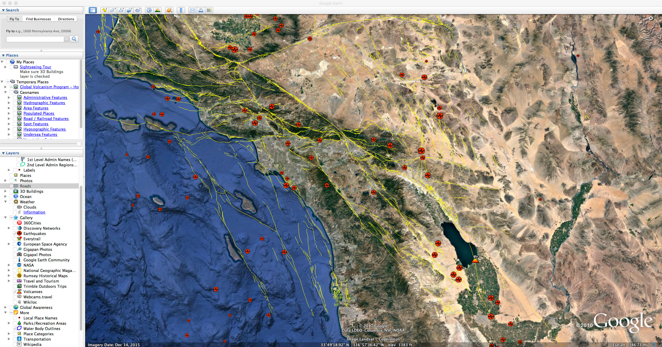 Fig. 4-47. Example of a Google Earth view of the southern California region with a KMLs layer added that show the location of mapped faults, historic earthquakes, and volcanoes. Many more data sets can be turned on or off while exploring regions on Google Earth. Fig. 4-47. Example of a Google Earth view of the southern California region with a KMLs layer added that show the location of mapped faults, historic earthquakes, and volcanoes. Many more data sets can be turned on or off while exploring regions on Google Earth. |
Examples of data in KLM formats USGS Earthquake Hazards Program - Google Earth/KML Files https://earthquake.usgs.gov/learn/kml.php This website provides KML information about real-time earthquakes, mapped locations and history of known earthquake faults, tectonic plate boundaries, geologic maps of the San Francisco Bay region. National Weather Service - National Weather Data in KML/KMZ formats http://www.nws.noaa.gov/gis/kmlpage.htm |
Geology and Mapping |
| The discussion below in an introduction to geologic maps, with an introduction landscape features associated with regions around North America. The links between the traditional landscape studies and mapping of geography and geology intersect in the science of geomorphology. GeomorphologyGeomorphology is the study of the Earth's surface including classification, description, nature, origin, and development of landforms and their relationships to underlying structures and the history of geologic changes as recorded by these surface features.Primary studies of landscapes involve generating map of many kinds, including natural landscape features (such as rivers, mountains, shorelines), man-made features (cities, roads, dams, etc.), ecology and land use (natural and agricultural) and much more. Regions of the North American landscape have been subdivided (and classified in some measure) in to regions called physiographic provinces. A physiographic province is a region that has distinct landforms and subregions with shared physical characteristics, such as topography (relief), geologic history, ecology, and climate. Physiographic provinces may display distinct landforms associated with subsurface rock types of common geologic origin, or structural elements. Physiography provinces may have significance to political boundaries, but they can encompass or cut across state and country borders, or political districts. Physiographic provinces stand out on a shaded relief map of the United States when you compare the topography with regional geology (Figures 4-48 to 4-51). |
Comparison of shaded-relief map with physiographic provinces and geologic map of the conterminous United States
|
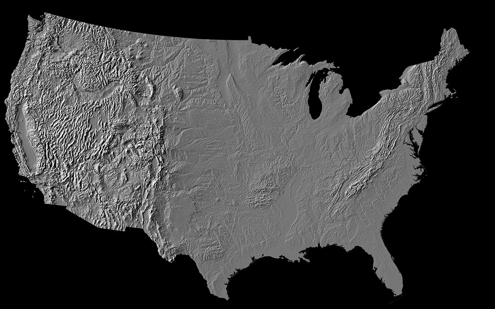
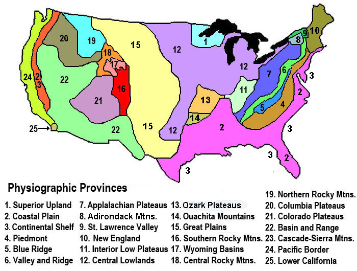
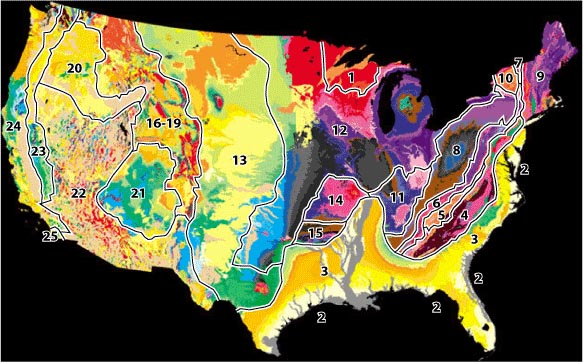

For more detailed discussion on physiographic provinces see: Regional Geology of North America.This website provides an overview of all the physiographic provinces of the United States. Examples of maps, photography, and discussions highlight aspects about each of the physiographic provinces and subregions of the United States. |
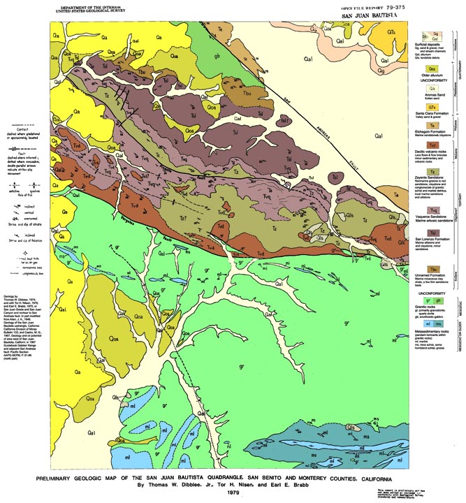
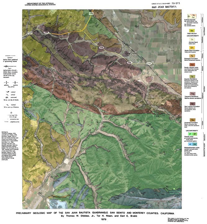
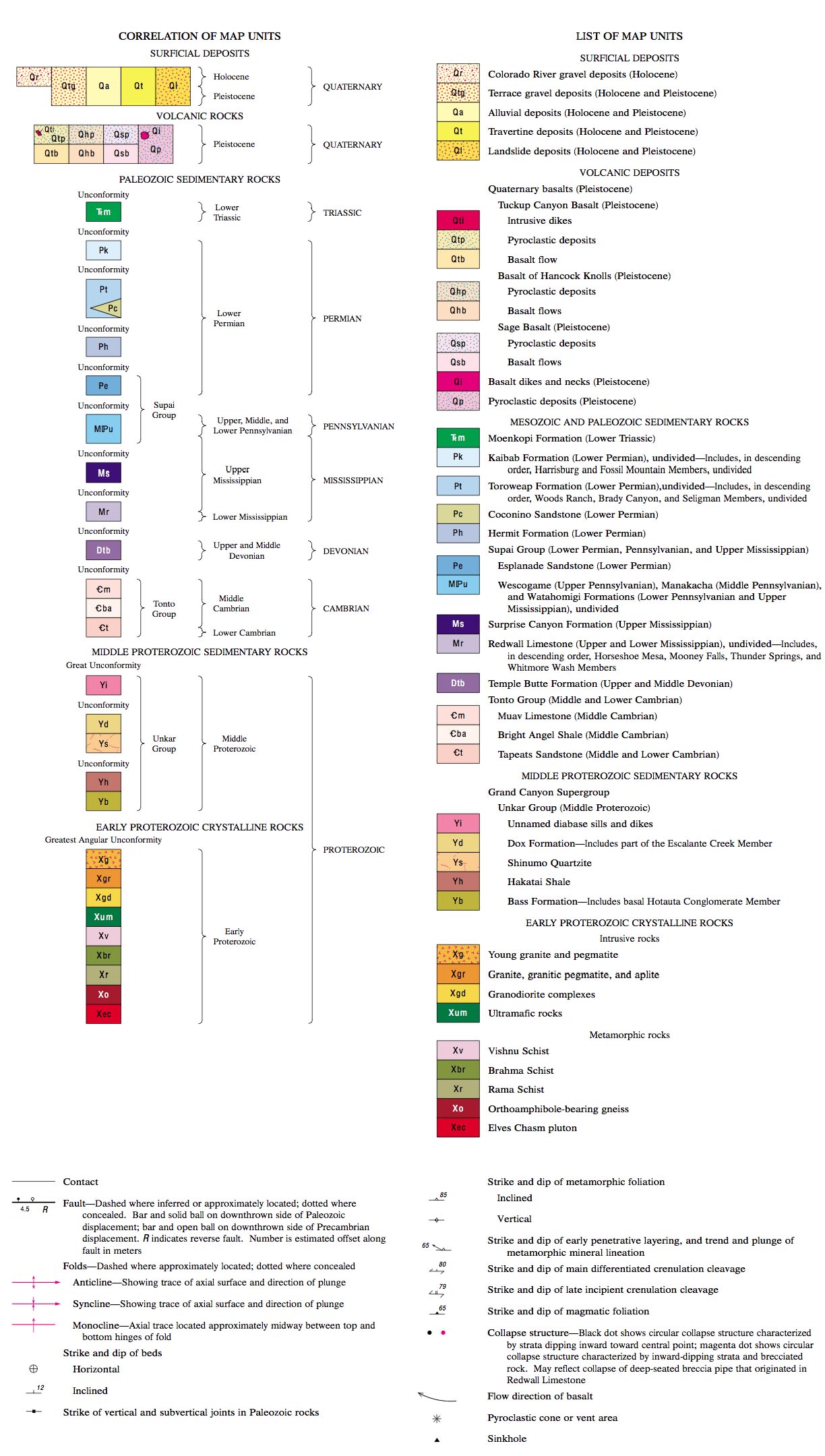
What is a Geologic Map?A geologic map is a special-purpose map made to show geological features. Types and ages of rock units are shown by color or symbols to indicate where they are exposed at or near the surface. A geologic map records the distribution, nature, and age relationships of rock units and the occurrence of structural features (such as the location of faults). Geologic features are illustrated as colors, lines and symbols.Geologic maps depict the land as if all soil and vegetation were stripped away. Geologic maps show bedrock characteristics (geologic materials and features), and may display shallow surface sediments (alluvium, landslide deposits, floodplain deposits, sand dunes, etc.). Colors on a geologic map are linked to areas where the bedrock in a region consist rock formations of similar geologic age and composition (example Figure 4-52; the same colors are used for cross sections associated with the map, Figure 4-53). Lines on a geologic map are used to indicate boundaries between rock formations or rocks of different ages, fault lines, and symbology associated with structural features (discussed in Chapter 6). |
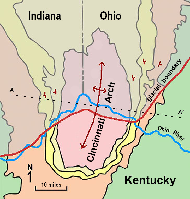 Fig. 4-52. Geologic map of the Cincinnati Arch, Ohio, Kentucky, and Indiana 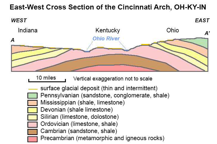 Fig. 4-53. Cross section of the Cincinnati Arch, OH-KY-IN. |
| Fig. 4-51. General geologic map of the Cincinnati Arch region, Ohio, Kentucky, Indiana. This is a fairly simple region to illustrate geologic mapping. The colors on the map show where rocks of different geologic ages occur in the region know as the Cincinnati Arch. The blue line is the Ohio River. A red line defines the glacial boundary (glaciers covered the region during the last ice age north of the red line; when the glacier melted it left behind thin glacial debris deposits on the surface. The red lines with arrow points and small red dip symbols indicate which way the sedimentary strata is dipping gently away from the crest of the structural arch. Figure 4-52. East-West Cross Section of the Cincinnati Arch, Ohio, Kentucky, Indiana. The cross section is made along the line between the letters A and A' on Figure 4-51. The cross section shows the general geologic arrangement of layers below the surface across the region. |
| Geologic maps are used to interpret the geologic history of a region. Geologic maps are used by paleontologists to find areas that are likely to contain fossils, and by geologists and engineers to define the location of faults, economic mineral resources, to find potential underground water resources, used in civic planning of infrastructure (placement of power plants, sewer systems, highways, bridges, buildings), and more. |
| Below is a list of essential concepts needed to interpret geologic maps. Note that some of the concept are addressed in more detail in other chapters (Figures 4-54 to 4-56). |
|||||||||
|
 Fig. 4-54. Common symbols representing geologic features on geologic maps. Concepts illustrated describe strike and dip for describing the orientation of strata (beds), and illustrations of structural features (folds and faults). |
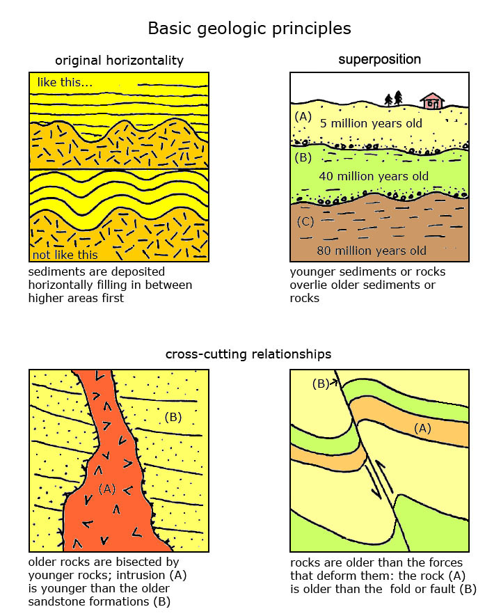 Fig. 4-55. Basic geologic principles: laws of original horizontality, superposition, and cross-cutting relationships |
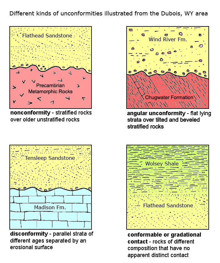 Fig. 4-56. Unconformities: types include nonconformities, disconformities, and angular unconformities. |
||||||
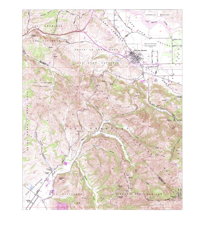
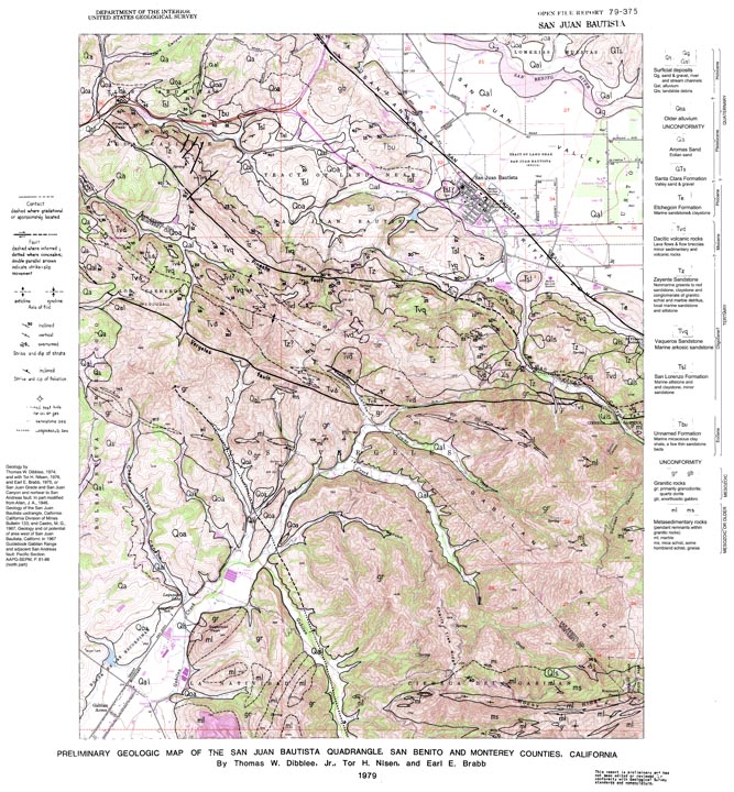
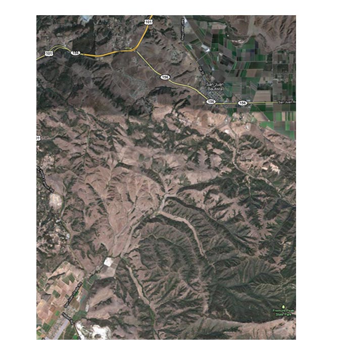
Comparison of a Topographic Map and Aerial Imagery With a Geologic MapMost of the past geologic mapping conducted in the history of the United States was using topographic maps as the base for interpreting the geology of a landscape. Both topographic maps and geologic maps have been created using aerial photography (when it became available). Geologists needed a basic knowledge of geomorphology and basic geologic principles to create map. Often geologic maps of many areas have been revised as new data became available. Geologic mapping can be very difficult, requiring geologists to try to access very rugged terrain and often hazardous conditions on the ground. In many areas there are no rocks exposed on the surface, and geologist have to make educated guesses as to what exists below the surface. However, new data provides incite for revising geologic maps. New data may include information found on satellite imagery or aerial photography, discovery of previously unknown outcrops, fossils, new dates from absolute dating, or discoveries made during excavations for buildings and infrastructure. Topographic, aerial photograph, and geologic maps are compared for the San Juan Bautista 7.5 minute quadrangle, California in Figures 4-57 to 4-62. |
|||||||||||||||
Comparison of a topographic map with a geologic map
Comparison of a aerial photograph map (DOQ) with a geologic map
|
|||||||||||||||
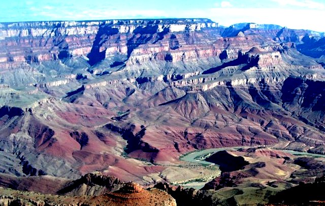
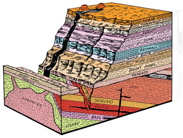
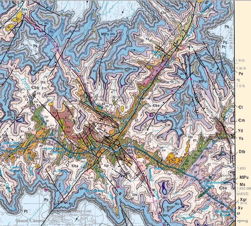
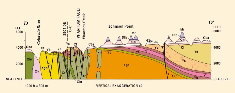
Interpreting the Earth structure with maps and geologic illustrationsGeologic Maps, cross sections, and block diagrams are used to show the structure of the Earth in three dimensions. Geologic maps show the arrangement of geologic features and materials exposed on or near the surface. Cross sections show interpretations of geologic features, structures, and materials in vertical profiles, usually perpendicular to the surface.Examples below are from part of the Grand Canyon, Arizona area (Figures 4-63 to 4-67). (The map and associated figures modified from Billingsley, G. H., 2000, Geologic map of the Grand Canyon 30' x 60' quadrangle, Coconino and Mohave Counties, northwestern Arizona: U.S. Geological Survey Geologic Investigations Series I-2688, map scale 1:100,000. http://pubs.usgs.gov/imap/i-2688/). |
|
Finding Geologic Map InformationTo find a geologic map of portions of the United State it is usually essential to find the name of the topographic map name of a particular region. The USGS typically names small scale geologic maps with the name of the 7.5 minute topographic map quadrangle (1:24,000 scale). Larger scale (regional maps) are named after the 1:100,000 maps (1° x 2° quadrangle) or larger 1:250,000 scale. State geologic maps are typically 1:1,000,000 scale or larger.Geologic maps can be located using the National Geologic Map Database: http://ngmdb.usgs.gov/ngmdb/ngmdb_home.html The National Geologic Map Database provides access to maps in digital formats and bibliographic information for maps published in paper formats that might be located in library map collections or purchased from the US Geological Survey and state geological surveys. Unfortunately accessing paper map collections is becoming increasingly difficult because the high cost of maintaining these antiquated collections. |
| Important additional resources for interpreting geologic maps FGDC Digital Cartographic Standard for Geologic Map Symbolization http://ngmdb.usgs.gov/fgdc_gds/geolsymstd/download.php Symbols Used On Geological Maps |
Geologic maps and topographic maps for the San Diego County coastal region:Oceanside 1:100,000 scale map and 1:24,000 scale maps (coastal northern San Diego County)San Diego 1:100,000 scale map and 1:24,000 scale maps (coastal southern San Diego County) These maps modified from geologic maps and topographic produced in collaboration between the USGS and the California Geological Survey. These maps are very useful resources for studying regional geology in western San Diego County! Selected field trip destinations in San Diego County — Places to see regional geology. |
Chapter 4 Quiz questions