The Everything Weather Lab For Southern California |
"Weather—you like it or not—you should NOAA-bout it."This lab is an introduction to weather and the weather and oceanographic information provided by the National Weather Service (NWS) and other research and digital data produced by the National Oceanic and Atmospheric Administration (NOAA). The focus of this lab is on weather conditions here in San Diego/Southern California region, but all the information provided has relevance to other regions of the nation and the world. |
 |
| Click on images for a larger view or a web link. |
| The lab questions 1-8 below refers to the website "California Clouds and Weather." The rest of the lab follows the content to the website "Weather Information For Southern California." Note there are many links on this lab website that connect to government websites. Hopefully they will all be working while you complete this lab. To submit answers to the questions, copy the contents of the Worksheet into a text editor and enter your answers for each of the questions. You may want to print out a copy of the Worksheet to use while you read the website and follow through the lab instructions below. The lab is divided into two section: Part A and Part BPart A counts for one lab exercise (for one week).Part B counts for a second lab exercise (for the following week). |
Weather Lab - Part A |
Step 1. Go outside and make observations about the sky.Make sure you find a place nearby that you can get a relatively good view in all directions (north, south, east, west, and UP).Answer the following questions. |
Question 1. State the exact date and time that you went outside to look at the sky! Question 2. Use your own words to describe the sky as you currently observed it. (Note: Your professor can verify the sky conditions for any date and time using NWS resources. This lab should be completed in the time window established for this lab). |
Step 2. Review the website: California Clouds and Weather.
Questions 1 to 8 below refer to this website. |
| On this website you will see a General Classification of Naming Clouds. Cloud names have Latin roots, and they are named in a similar fashion to plants and animals—using genera and species. There are also special names for certain types of cloud patterns or features called cloud varieties and accessory clouds. In addition, there are optical phenomena associated with clouds and sky conditions related to dust particles and pollution in the atmosphere. Here is a link to a Glossary of Cloud Terms and Classification. Sections of the glossary describe or define different topics and terminology related to clouds and atmospheric phenomena. |
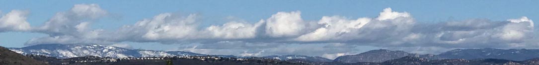
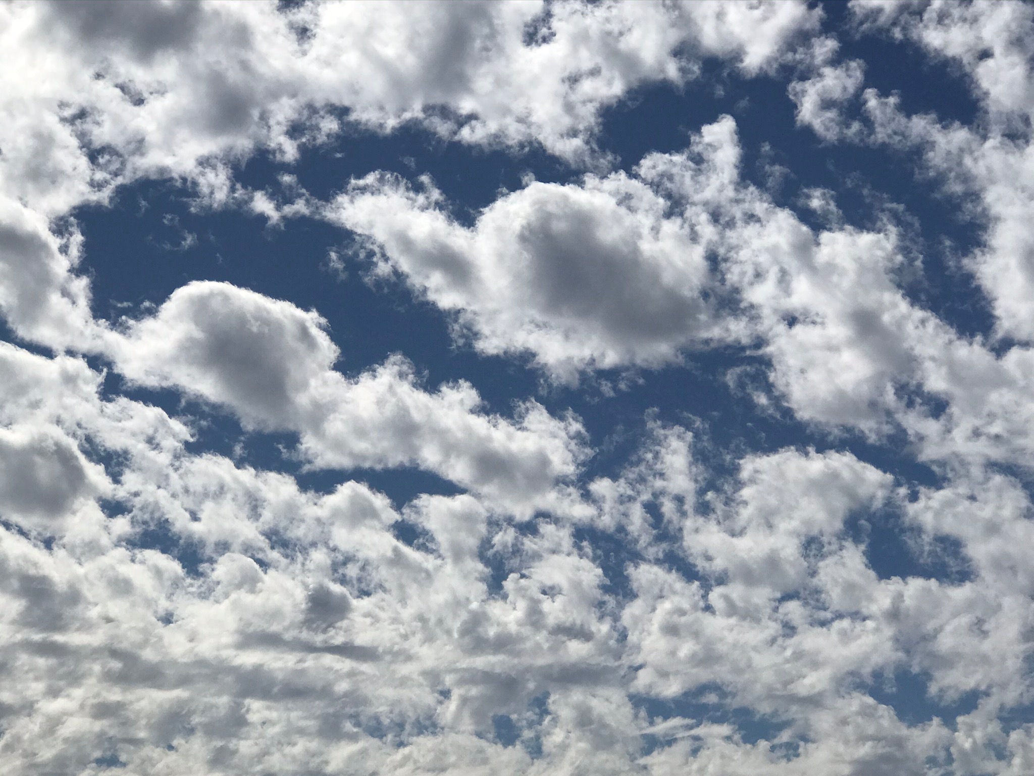
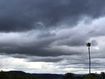
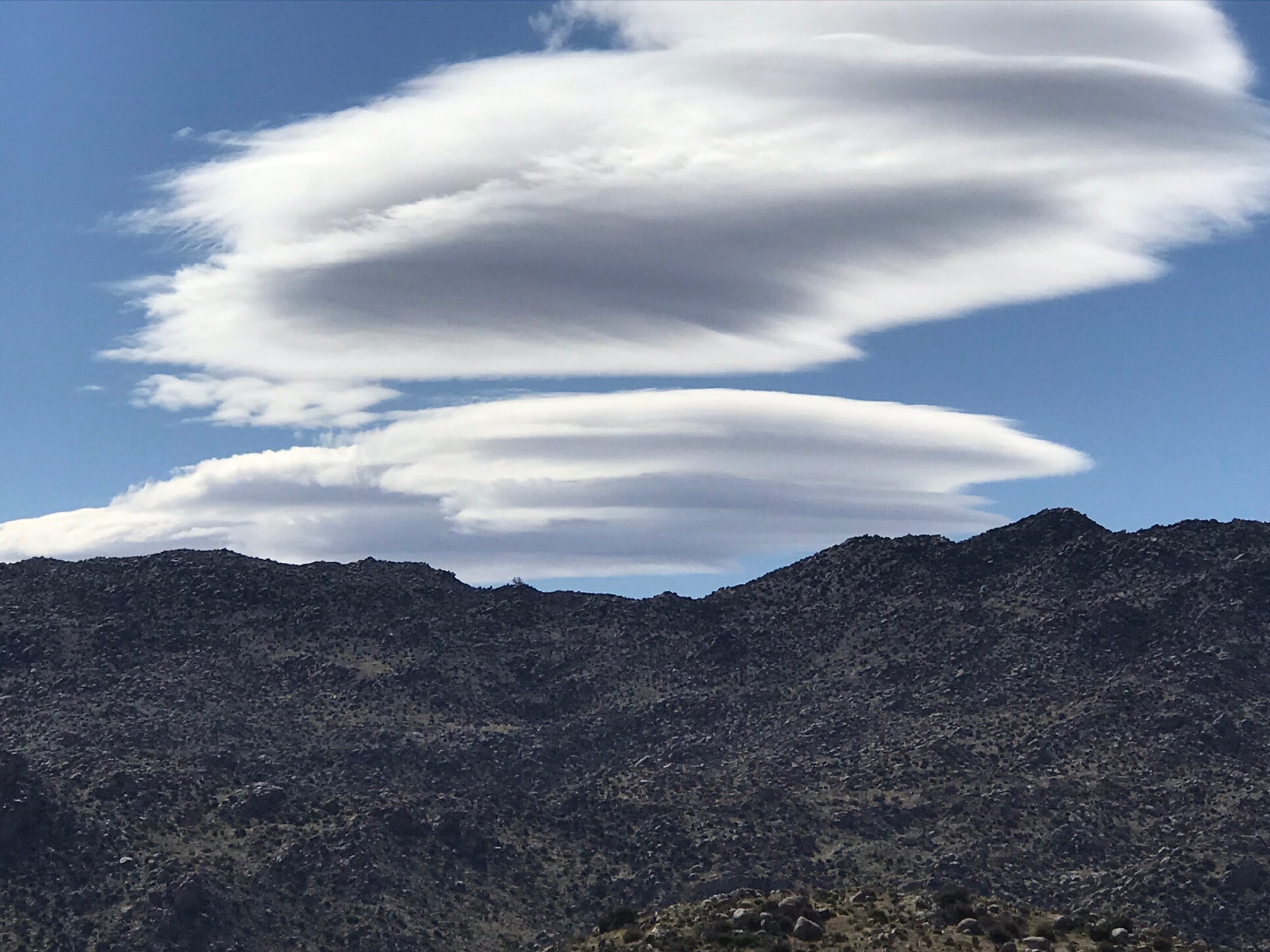
Study the images of clouds below and provide the cloud names that you think best apply. |
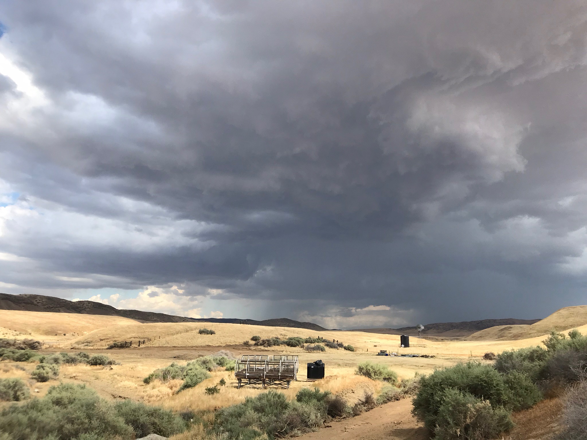 Cloud A |
 Cloud B |
 Cloud C |
Question 3. What is the genera name of the cloud illustrated by Cloud A? (Hint: this cloud produced a lot of thunder and lighting, heavy rain, and some hail.) Question 4. What is the genera name for these kinds of high, wispy clouds in Cloud B? Question 5. What is the genera name of this very foggy type of cloud hugging the top of a local mountain in Cloud C? |
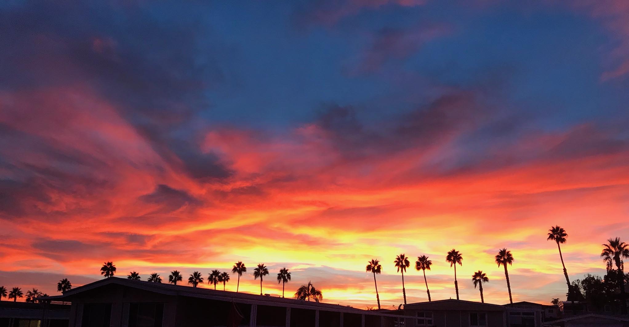
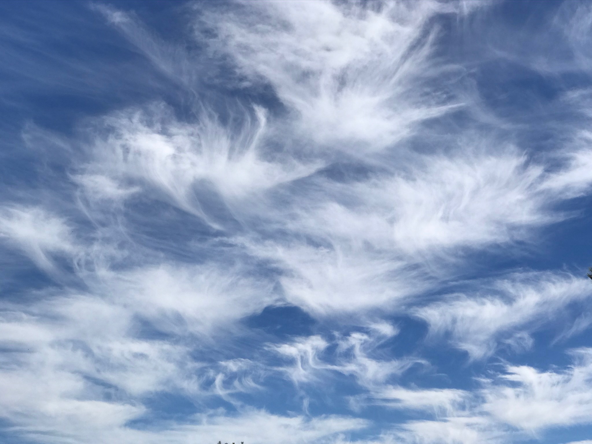
 Cloud D |
 Cloud E |
 Cloud F |
Question 6. What is the genera name of these "fair weather" clouds - Cloud D? Question 7. What is the genera name for these flat-bottom mid-level clouds in Cloud E? Question 8. What is the name for these unique clouds hanging above the high peaks in the San Diego mountains - Cloud F. |
Step 3. Review the website: Weather Information For Southern California
Questions 9 to 14 below refer to Sections 1-1 to 1-6 on this weather-info website. |
| You should read through this website to get familiar with it before starting on the tasks listed below. The questions and tasks that follow will require you to go to National Weather Service websites. Note that NOAA and the National Weather Service is constantly making upgrades to their computer systems, software, and the data they are collecting. Sometimes the URLs for different resources change with upgrades. Hopefully all the website used will all be accessible and working properly when you are doing this lab! Some pages may take longer to load if web traffic is slowing the systems. |
Step 4. Log into https://www.weather.gov/On this Main Page, enter your "city, state" or zip code and hit GO, This will take you to the local forecast for where you are at located. |
Question 9. What is the name of the NWS Forecast Office closest to where you are located? Question 10. Enter the following information listed for the location associated with your "City, St" or zip code. What is listed for: Current Conditions: ___________________________ Temperature (in °F or °C): ___________________________ Humidity: ___________________________ Wind Speed: ___________________________ Barometer (in millibars): ___________________________ Dew point (in °F or °C): ___________________________ Visibility: ___________________________ |
Look at the "extended forecast" to answer the following questions: |
Question 11. Over the next 5 days, which day will have the highest temperature? Question 12. Over the next 5 days, which day will have the lowest temperature? |
| On your local Forecast Office website, find the link to Weather Hazards Outlooks. (It may be listed under News Headlines.) |
Question 13. What weather advisories, watches, or warnings are currently forecast for the following week? (Note: This changes frequently, and there may be none.) |
On the list below match the name of the instrument with what it does. |
Question 14. On the table below match the letter (A to K) to the name of the instrument used for measuring atmospheric phenomena.
|
Read the sections related to Weather Maps and Information (Sections 1-7 to 1-13 on the ) |
This section of the website reviews the Daily Weather Maps for the conterminous United States. The maps include a surface weather map, maximum and minimum temperature maps, a 500-millibar height contour map, and a 24-houur precipitation map. |
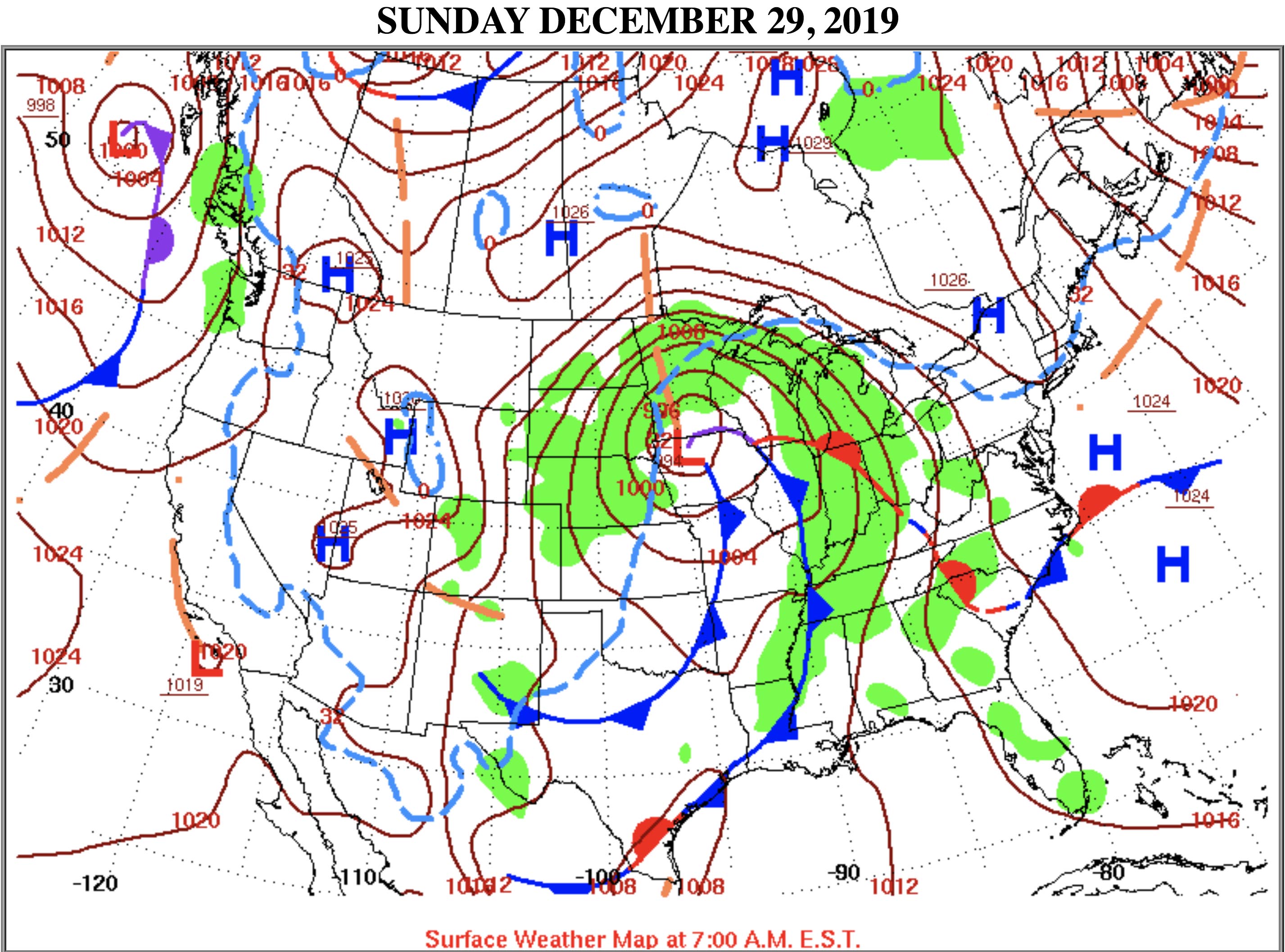 Example of a Daily Weather Map (without weather station data) |
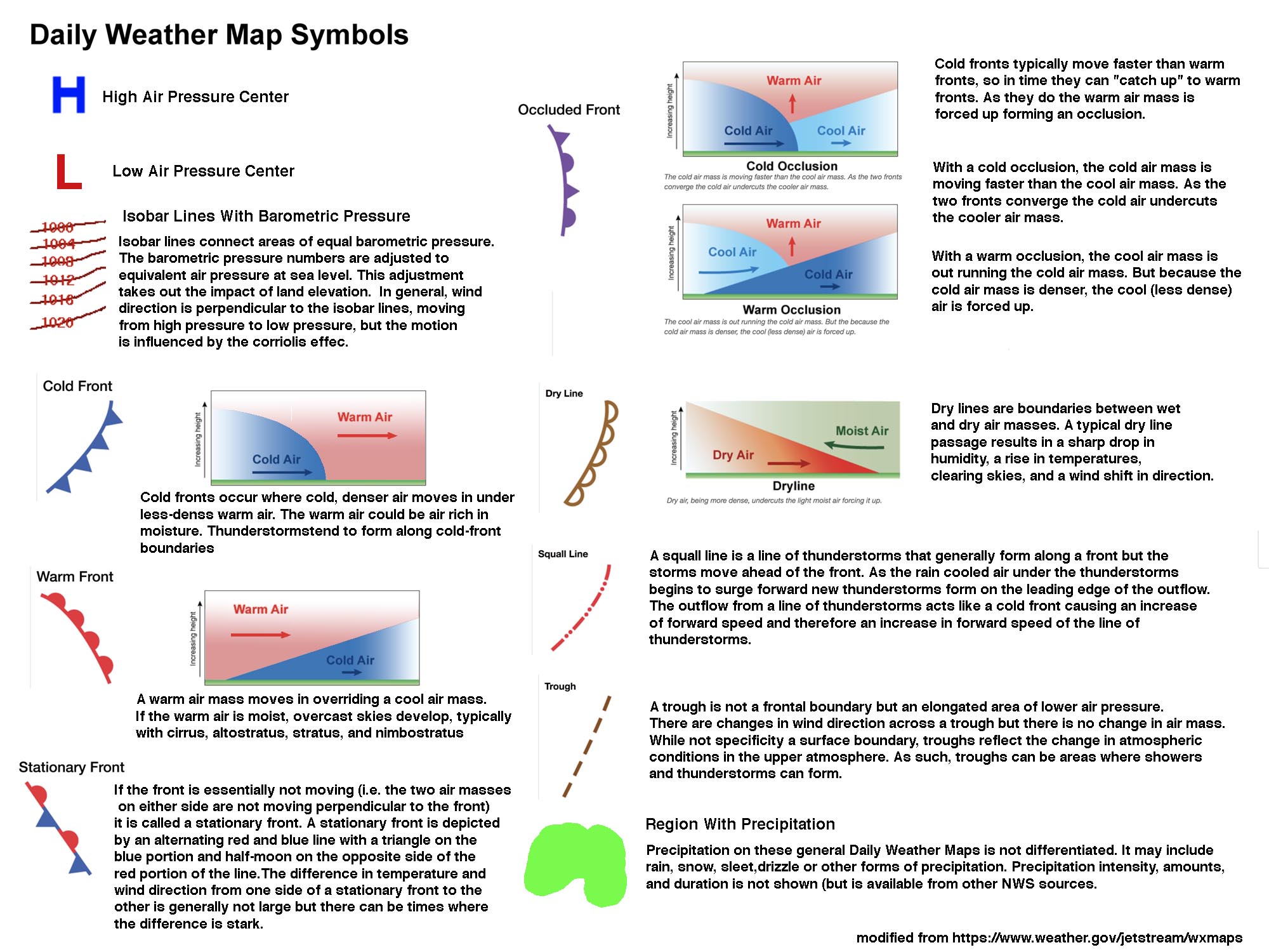 Daily Weather Map Symbols and explanations. Daily Weather Map Symbols and explanations. |
Go to the Daily Weather Maps page: https://www.wpc.ncep.noaa.gov/dailywxmap/Start by looking at today's Daily Weather Map. Answer the following questions. |
Use today's Daily Weather Map and make these observations: Question 16. How many high pressure centers are on the map? Question 17. How many low pressure centers are on the map? Question 18. How many cold fronts are on the map? Question 19. How many warm fronts are on the map? Question 20. How many stationary fronts are on the map? Question 21. How many troughs are on the map? Question 22. What would you describe as the most significant weather feature on the map? |
Accessing Daily Weather Maps for historical weather events. |
Hurricane Katrina, August 23- September 2, 2005 |
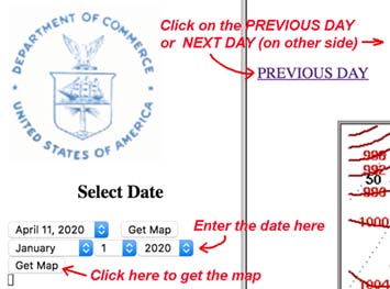 |
Observe Daily Weather Maps for Hurricane KatrinaWatch Hurricane Katrina track across Florida, enter the Gulf of Mexico, then move onshore in Louisiana. Note the barometric pressure change each day as it moves.Use the Select Date option and choose the date of August 23, 2005 and hit "Get Map." Click on the "NEXT DAY" link in the upper right corner. Continue clicking on the NEXT DAY and watch how the weather patterns on the map change from one day to the next. You can hit "PREVIOUS DAY" to go back to repeat observations. For Hurricane Katrina, use the Daily Weather Maps web page. Start with Select Date : August 23, 2005 and proceed to September 2, 2005 by clicking on the NEXT DAY tab for each day. |
Question 23. What day had the lowest air pressure at the center of Hurricane Katrina? Question 24. What day did the center of the hurricane move onshore over New Orleans? |
Observe Daily Weather Maps for Hurricane SandyWatch Hurricane Sandy move from the Caribbean region and strengthen before moving onshore in the Mid Atlantic region before loosing steam and moving offshore of Canada. Use the Daily Weather Maps to observe the movement Hurricane Sandy.Use the Daily Weather Maps web page. Start with Select Date: October 26, 2012 and proceed to November 4, 2012. |
|
Observe Daily Weather Maps for a "Pineapple Express"Click here to see a NOAA animation of a Pineapple Express event that occurred in January 2-8, 2017. |
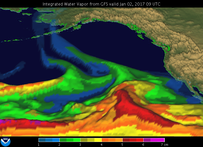 |
| A Pineapple Express is a narrow region of atmospheric moisture flow that develops in the tropical Pacific around Hawaii and creates an "atmospheric river" that can dump large quantities of precipitation (rain and snow) on the West Coast. Two powerful Pineapple Express storms that heavily impacted Southern California occurred on January 7-11, 2005 and December 15-22, 2010. A Pineapple Express storm even produced a rare tornado in Los Angeles on December 12, 2014. These storms happen about 2-3 times per decade. Animation source: What is the Pineapple Express? https://oceanservice.noaa.gov/facts/pineapple-express.html |
| Use the Daily Weather Maps web page. Start with Select Date: January 6, 2005 and proceed through maps each day to January 12, 2010. |
Question 26. What atmospheric feature shown on the Daily Weather Charts is responsible for the long duration of the Pineapple Express event between January 6-12, 2005? (Hint: look in the vicinity of Southern California on each map. It will be one of the following: a cold front, a warm front, a stationary front an occluded front, or a dry line.) |
Observe Daily Weather Maps for a Santa Ana Winds event |
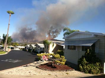 |
Santa Ana winds are strong winds that blow from a north to northeast direction that impact Southern California. The are most common between in the fall-winter-spring seasons. When they occur they are typically the lowest humidity weather of the year. They may last several days, and their wind speeds typically can exceed 40 miles per hour, and can produce wind gusts that exceed 80 to 100 miles per hour. As a result, Santa Ana winds, when combined with warm temperatures, are frequently associated with Southern California wildfires. An example of a Santa Ana winds event is partly responsible for the 2014 Cocos Fire that impacted the San Marcos and Escondido region of San Diego County (illustrated here). The fire peaked on May 14-15. |
|
| Use the Daily Weather Maps web page. Start with Select Date: May 12, 2014 and proceed to May 17, 2018. Look at features on the Surface Weather Maps and the Maximum/Minimum Temperature Maps for the southwestern region of the United States. |
Question 27. What atmospheric features shown in the Daily Weather Maps is most responsible for the development of the Santa Ana winds? Select one or more from the following choices: (A) A series of low pressure troughs became established along or near the coastline of Southern California during this period. (B) High atmospheric pressure centers slowly moved into the the Nevada Great Basin region and the Desert Southwest (AZ, CO, NM, UT) region. (C) High amounts of rainfall fell in the Mississippi River valley and East Coast regions. (D) Heat from the fires cause the Santa Ana winds . |
Go To the Graphical Forecasts section of the National Weather Service website.The URL for the website is https://digital.weather.gov |
| Click on the images below to see how to navigate to zoomed-in views on a variety of "map layers" on the National Digital Forecast Database Display (NDFDD). With this system, you can a region around the world or zoom in to local map areas. You can view real time and forecast information for the next week or so on a variety of weather and oceanographic data. |
| You should take a look at the Graphical Forecast instructions #1, #2 and #3 below before you continue. (Click for larger views.) |
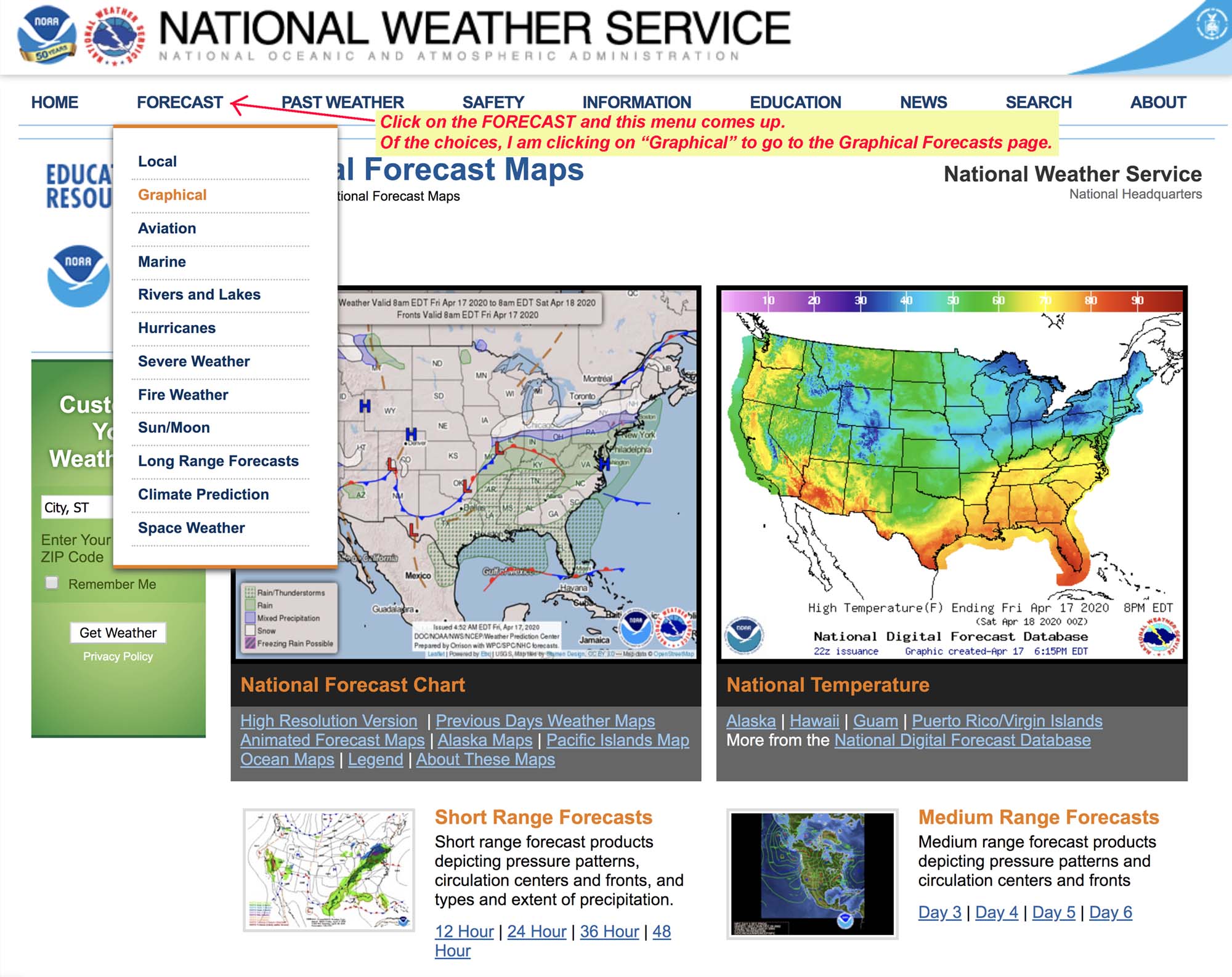 Graphical Forecast instructions #1 |
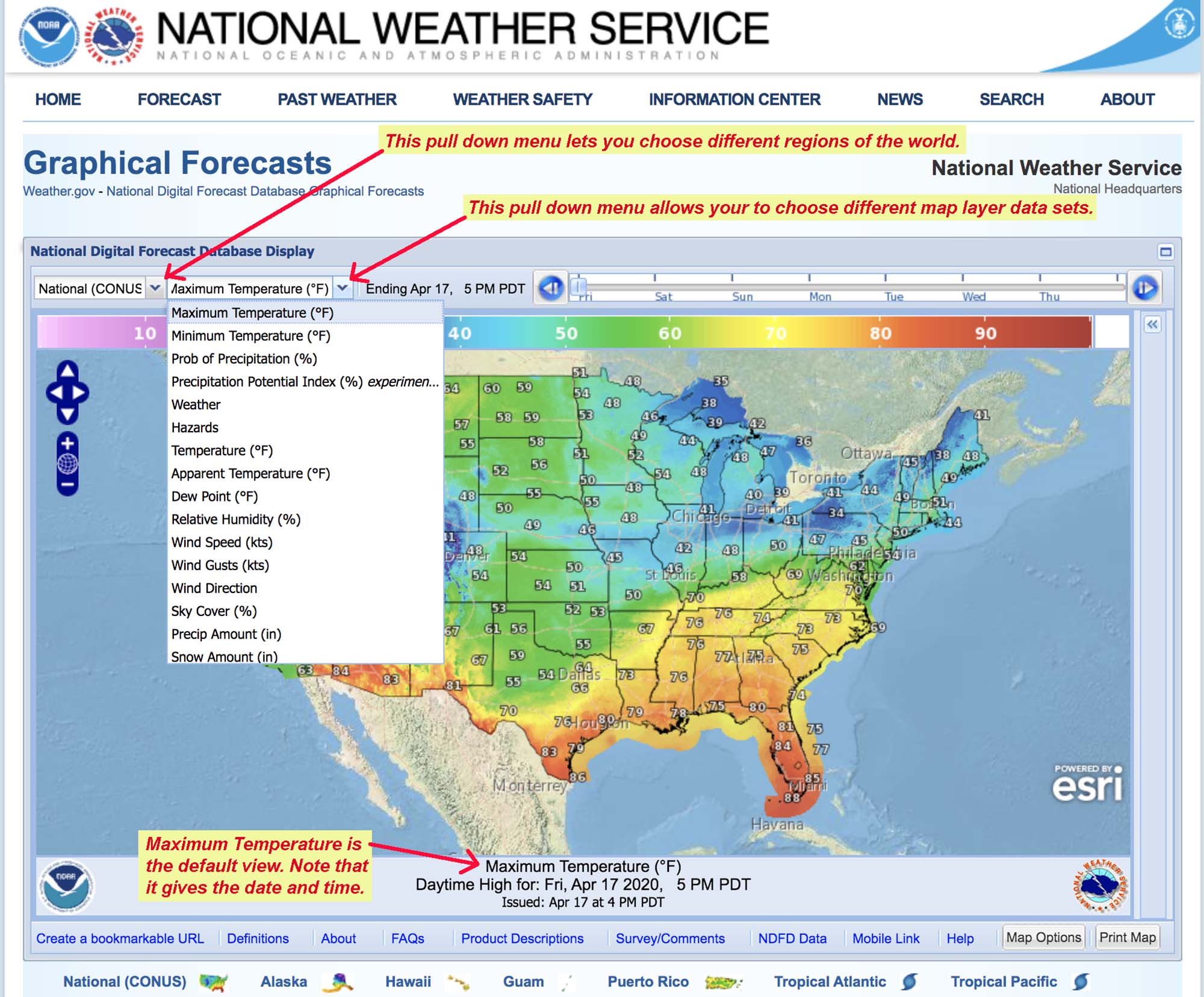 Graphical Forecast instructions #2 |
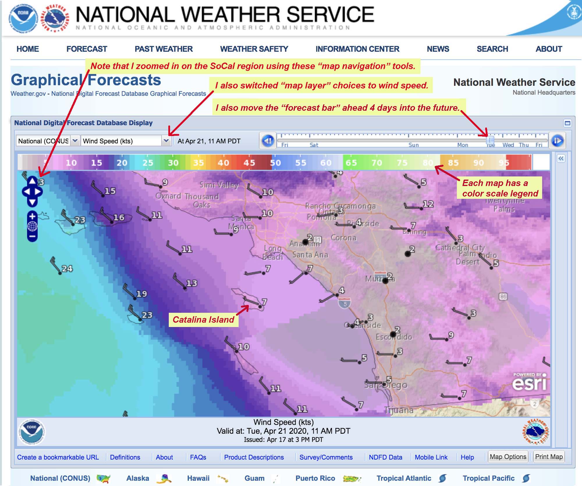 Graphical Forecast instructions #3 |
| Open the National Digital Forecast Database Display (NDFDD) and use the navigation tools to zoom into the San Diego region including Catalina Island (located about 140 miles northwest of San Diego). Use the following scenario. |
Weather outlook Scenario: Catalina Island"You have been tasked with the job of planning a boat trip for a crew of marine biologists who want to film sea life underwater around Catalina Island.You can go leave any day during this coming week. However, you need to pick a day likely to have either the least cloud cover or least windy conditions. Both conditions on the same day would be ideal." |
| Note that options on the NDFDD layers menu include both Wind Speed (knots) and Sky Cover (%). Select the Wind Speed layer and use the forecast bar to move from one day to the next. Now do the same with the Sky Cover layer. Note that there is a color scale legend at the top of each map. |
Question 28. According the Graphical Forecast Map for wind speed, which day of this coming week will be the least cloudy around Catalina Island? Question 29. According the Graphical Forecast Map for sky cover (%), which day of this coming week will be the least windy around Catalina Island? |
Go to the National Weather Service Enhanced Radar Map Image Loop website.Watch this streaming one-hour loop of the observable pattern of clouds and precipitation intensity as it moves across the country. Note the DBZ scale bar on the right. |
NWS Enhanced Radar MapThe NWS Enhanced Radar Map is a mosaic of weather radar station data collected from all over the nation. It is also called the National Radar Mosaic.Radar is more effective that satellite imagery is some ways because it can see what is lower to the surface where precipitation is falling, whereas satellite imagery may be blocked by upper-level cloud cover. The weather radar equipment uses special reflectivity sensors—they are capable of "seeing" precipitation droplets (or ice/snow/hail, etc.). The radar signal reflected back from the clouds can discern the size classes of droplets or ice or dust particles. The "Reflective versus Rainrate" map legend scale shows variation in intensity of the reflected radar beam. |
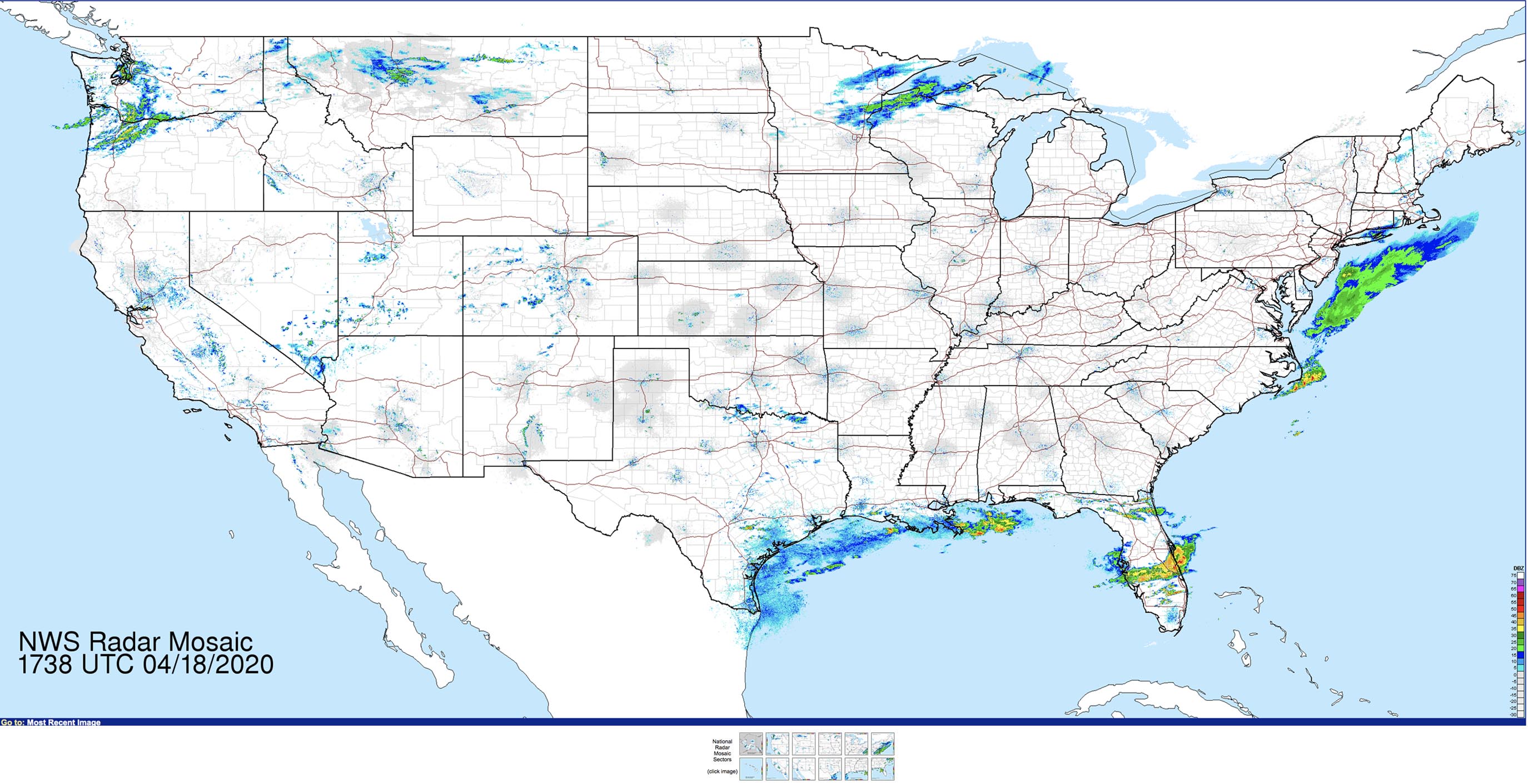 Snapshot of the National Weather Service Enhanced Radar Map Image Loop. Click on the image or the link to go to the looping map view to see the current conditions and how they have changed over the past hour. The legend scale,"Reflectivity versus Rainrate," is on the lower right side of the website map image. |
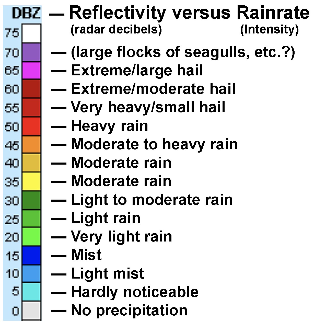 |
Study the map and make observations about where the areas are receiving precipitation.The first thing to do here is record the time that you looked at the map to make your observations. The time and date is the number in the lower left of the map beneath where it says "NWS Radar Mosaic." This time is in UTC (Coordinated Universal Time). UTC is the primary time standard by which the world regulates clocks and time. You now need to convert the UTC to the current time here at home (assuming you are here in the Pacific Time Zone). Record it as Question 30. |
Question 30. What time did your look at the National Radar Mosaic? (This is for your instructor to check.) Question 31. What was the highest reflectivity number and rainrate (intensity) that you observed currently on the map? Question 32. Where was this precipitation occurring (name the general region or state)? |
Click on the NWS Radar Mosaic in a general location where you live.This will take you to your local radar station. You can also find the radar closest to you by entering your zip code on the NWS Main Page, then click on the link to your Local Forecast Office. there is a radar link there. |
 |
San Diego Local RadarThe local radar image provides greater detail on what is happening in your area. This view is for the San Diego, CA Radar. Like the larger map discussed above, it provides a looping views showing how the weather has changed in the past half-hour. You can watch storms build up and move across the region. Weather alerts may be posted.You can choose Short Range Images of the "Composite" (the combination of other radars as in the region), or "Base" (just the local radar). The composite is best for a regional view of moving storm systems. The local view also allow you to view rainfall totals... for the last 1 hour or for a storm total (days). The radar can show a variety of data. It may be showing light rain in the area, but that might be precipitation that is falling from the clouds, but is evaporating before it hits the ground. On some days, there may be a bit of light sparkling of colors, particularly over the mountains, and even on a clear-sky day. This may be any number of particulate materials ranging from birds, insects, pollen, dust, or debris blown by the wind. |
Question 33. Describe what you are currently seeing on your local radar. Is there any weather activity in your area? |
| The sections below cover weather forecasting, storm, and climate prediction starting at at Section 1-17 in the guide: Weather Information For Southern California. |
| Review the Types of Precipitation (see Section 1-17) and examine the following websites links before answering the questions below. National Weather Radar Mosaic National Forecast Charts |
Question 34. What states shown on the the National Weather Radar Mosaic currently show any regions of show heavy precipitation (orange to red colors) on the map? List states (CA, FL, NY, etc) or regions (such as Northeast, Mid Atlantic, Gulf Coast, Great Plains, Midwest, Great Lakes, Rocky Mountains, etc.). Question 35. According to the National Forecast Charts, are there any areas of Severe Weather, Critical Fire Weather, or Flash Flooding in the next three days? List them like in the question above. |
Now it's time to take a break and go back outside and look at the weather!Before you go outside, look to see if anything on the local weather radar might be weather you can observe in your area or see on the horizon. |
Question 36. Use your own words to describe the sky as you currently observed it. How has the weather changed since you last observed it? What kind of clouds do you see? Did the local weather radar show anything that you can see in the sky? |
Weather Lab - Part B |
| Go to the Short Range Forecasts (Days ½-2½) web page (see Section 1-18). Click on the loop option to watch how weather systems (highs, lows, fronts, barometric pressure lines, etc.) move across the country in the coming 3 days. choose a weather element (such as a High (H), a Low (L), a storm (greens or blues), or a front that is impacting the West Coast (CA, OR, WA) on the first day and note how far the feature is predicted to move by the third day. Make a rough estimate in miles the feature/storm has traveled. For example:
|
Question 37. What is the weather element did you choose, and how far is it projected to move across the country in 3 days? (Estimate miles in 3 days.) |
| Go to the Extend Range weather forecast and outlooks web page (see Section 1-19). Examine the links to answer the following questions. |
Question 38. What region of the country is expected to have below normal precipitation over the next 90 days? Question 39. According to the Crop Moisture Index, what is the general soil moisture condition for planting forecast for the San Diego area? (Choices range from Severely Dry, Slightly Dry/Favorably Moist, to Excessively Wet, etc.) |
Look up the current 24-hour precipitation total map for the San Diego area.Use the link above to quickly get to this website. This links is unfortunately buried on the San Diego Forecast Office website under the menu heading for "Rivers and Lakes." On the Rivers and Lakes pull- down menu, click on Hydrology, This takes your to the the San Diego region Hydrology page. On the Hydrology Observations page, look below the "Observations - Rainfall and River Levels" to the links for Rainfall-San Diego County. Links are provided for Maps of the 1-hour, 6-hour-, and 24-hour rainfall totals for precipitation recorded at weather stations around the county. |
Question 40. According to the recent 24-hour rainfall totals map, what was the maximum rainfall total and what is the name of station where it was recorded was as shown on this map? (Note: the number may be 0.00 or M for "missing." In this case, record the data for the location that may be closest to you if you live in this county. The highest rainfall totals are typically in the mountains.) |
Go to the Weather Prediction Center website.Click on QPF on the gray menu bar. This will bring up the Quantitative Precipitation Forecasts interactive map for this coming week.Above the map, click on the tabs for each day and watch the precipitation amounts change: Day 1 | Day 2 | Day 3 | Day 4 | Day 5 | Day 6 | Day 7 Then, do the same for the tabs for Total: Day 1-2 | Day 1-3 | Day 1-5 | Day 1-7 Note the scale bar on the left side of the map - this is precipitation in inches. |
Question 41. On what day did the most intense precipitation occur and where (in what general area: state or region). Question 42. By the end of this map forecast (Day 1-7), what general area received the most precipitation and in what total amount? (according the the scale bar). |
| Check out the Excessive Rainfall Forecasts and the Significant River Flood Outlook maps. Look for an area where there might be flooding actively occurring. There is typically flooding happening somewhere, every day. (These maps are described in Section 1-21.) Now go to the River Observations website (described in Section 1-22). Note there are lots of small colored circles and diamonds when this website is fully loaded. (This website may be slow to load; if it freezes up, hit the reset view or close and reopen to link). You can zoom in on the map or click on a region. If you move the mouse around on the map to the different shapes, the current stream gauge data should appear. Click on one and it will open a stream gauge chart showing changing water levels of a stream or river. The blue and green symbols indicate locations where streams are below flood stage. The colors of yellow, orange, red, and purple show locations where the rivers or streams are at increasing level of flood stage. Each stream gauge chart lists the Flood Stage level in feet (left side of the chart). A sample chart for the San Luis Rey River in Oceanside California is illustrated in Section 1-23. If the river is in flood, you can see where the water level currently at (at the vertical blue line). Note the dates going across the top and bottom. There are typically 8 days in the past, and 12 days projected in the future. The past and current recorded stream level data is the in blue. The purple line indicates what a computer model projects the flow will be in the upcoming days or weeks. To calculate how high above flood stage a river or stream is, was, or will be, subtract the Flood Stage number (feet) from the "peak" stage flow number (feet). This will tell you how high above flood stage the river is (in feet). News reports typically report how many feet above flood stage a river might be, or when it will be. |
Question 43. What is the name of the river/stream gauge you have chosen, and what is the current river level in feet? Question 44. How many feet above flood stage "is,was, or will-be" at the peak flow currently shown on the stream gauge chart for the river you chose? |
Look at the 4 maps in Section 1-24 in the guide about Changes in Rainfall Patterns.Compare the top two maps with the bottom two maps. |
Question 45. What can you say about the precipitation history in Southern California in the 3-month period (Dec. 2019 to Feb. 2020) compared to the averages of the previous year? |
Open the GOES Image Viewer.GOES stands for "Geostationary Operational Environmental Satellite." The GOES image viewer allows you to select satellite views of different parts of the world using different "bands" of energy . Only two of the bands are in the range of colors our eyes can see (blue and red); the other bands in the near and far infrared range. The different bands are useful for viewing different atmospheric phenomena.On the GOES Image Viewer, you will see a map of the Western Hemisphere. Click on the Pacific Ocean just off the coast of California.. This will open a page called GOES-West - Sector view: Pacific Southwest. On this page there are 21 options to choose on how to look at current weather satellite imagery. Of the 21 choices, you will be looking at GeoColor, and Band 8. (You can look at more!) Note that under each "Band" option you have a variety of images you can download or view (small to large images, and animations). The best to view of the Animated GIF options. (The Animated Loop options are not as large or as detailed at the Animated GIF.) Start with the first choice called GeoColor. At the bottom of the option list under GeoColor click on Animated GIF (if one is currently available). This will bring up an animation showing the movement of clouds over the last 6 hours. Finally, move down to Band 8 and choose the Animated GIF. This band is used to study the movement of moisture in the upper atmosphere. |
| It is easy to get overwhelmed and lost on this website! It is a great source of free satellite imagery. You will get to see an easier place to see satellite imagery on National Hurricane Center website (next section). You can see why atmospheric scientists rely so heavily on weather satellite imagery. |
Question 46. Of the 2 choices, GeoColor and Band 8, (or others you chose to look at), which did you find most useful or interesting for observing the weather in the Southwest region? And, briefly explain why? |
Go to the National Hurricane Center (NHC) website. |
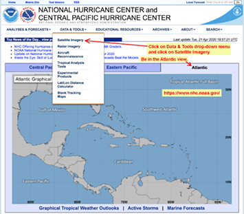 |
This website has a variety of features to explore! (There are lots of reports linked to this site, especially during Hurricane Season (June 1-November 30). Note that the "default" map is the Atlantic region. On the menu above the map you can switch between the Central Pacific, Eastern Pacific, and Atlantic regions. Below the map you can click on Graphical Tropical Weather Outlooks, Active Storms, and Marine Forecasts. |
|
| On the menu bar at the top, click on Data & Tools pull-down menu and click on Satellite Imagery. This takes you to "Latest Satellite Imagery" |
|
| This web page is loaded with links to looping imagery that is updated every 15 minutes. There are lots of links to Loops and Animated GIFs. They may or may not be active at the time for uncertain reasons. |
| Under GOES-E Full Disk (Atlantic), click on Loop under GeoColor - Hi-Res - Loop. |
Question 47. Briefly describe what this looping shows you. Include how many hours this video covers (beginning to end). [Hint: you can grab the blue button on the slider bar and pull it to the beginning or end to see the start and stop date and time.] |
| There are two operational GOES satellites currently working. GOES-East covers the Atlantic; GOES-West covers the Eastern Pacific. Under Atlantic Views, click on the GeoColor Animated GIF listed under the Gulf of Mexico list. |
| Question 48. Briefly describe any weather activity that catches you eye on the animation of the Gulf of Mexico Region. |
Return to the National Hurricane Center main page. Click on "Gulf of Mexico" on the map.This will take you to the website:Marine Graphical Composite Forecast Map for Gulf of Mexico Offshore Waters |
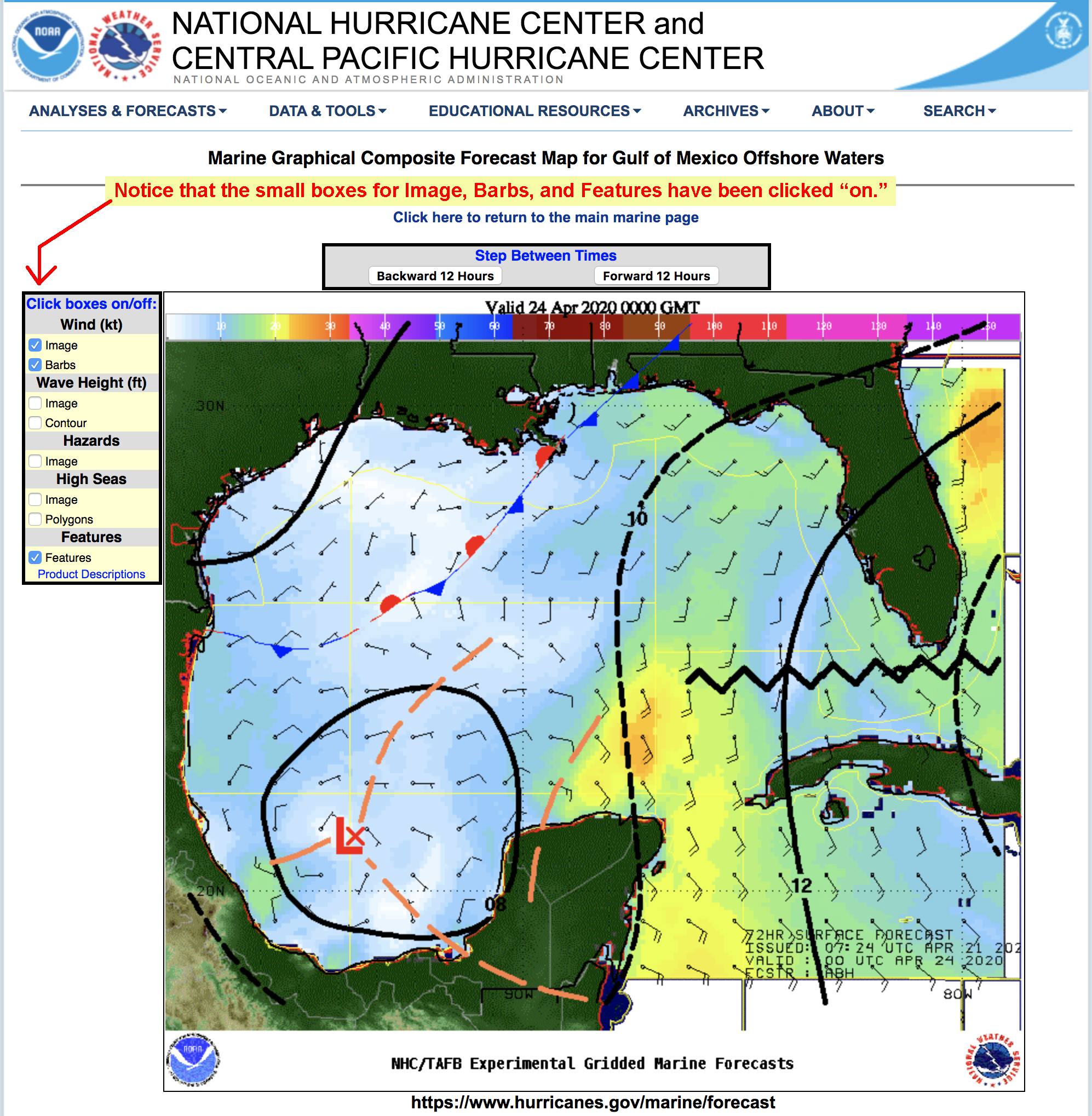 |
On this website you have options to add features to the map that describe oceanographic conditions including:
|
| Turn on Wind - Image & Barbs, and Features. Click on "Backward 12 hours" and "Forward 12 Hours." The Product Descriptions page provides a brief and useful synopsis. |
Question 49. Briefly describe what the most prominent weather feature you currently see in the region, or that is forecast in the next 12 hour for the Gulf of Mexico. |
| Section 1-28 describes how NOAA can study lightning activity with a storm with their Satellite Radar Lightning Loop Map. This interactive map isn't easy to navigate, so we won't do it here. However, it was used to create Animated GIF that is worth watching. Lightning is a good indicator of the intensity of storms. |
| Click here to watch the animation on lightning associated with Hurricane Dorian in fall, 2019. Notice the pattern of lightning strikes in the vicinity of the storm's eye and in the outer bands. |
Question 50. Where was the lightning most intense in this satellite animation of Hurricane Dorian? |
| Sections 1-29 to 1-32 in the guide is about air quality issues. The GOES satellite sensors are able to collect data on changing conditions in air quality based on selected pollutants and particles in the air. These include ozone, smoke, and particulate matter (dust from dust storms and airborne ash from volcanic eruptions). |
Examine the maps posted on the NWS Air Quality website.Scroll down on the page and you will see the most recent maps on these topics. At the bottom of the page click on Daily View.You can move your mouse over the time boxes and get changing satellite data of the ozone, smoke, and dust. Note that at the top of the table of map names you can click a tab for ahead 12 hours (or back 12 hours, etc.).Each map has a color scale above the map. Answer the questions below about air quality in the Southern California region. |
Question 51. Use the 1 Hour Average Ozone Concentration map. What time of day and date were the ozone concentrations the highest? Question 52. Use the Surface Smoke or Vertical Smoke maps.: If there was smoke in the Southern California area, what time of day was it most concentrated? If no smoke, say "no smoke." Question 53. Use the Surface Dust or Column Dust Concentration maps. If there was dust blowing in the air in the Southern California area, what time of day was it most concentrated? |
Go to the Washington Volcanic Ash Advisory Center (VAAC) website \.Examine the current map showing active volcanic eruptions posted there. |
Question 54. Are there any volcanic eruptions currently happening anywhere in North America? If yes, where is this occurring? |
| Examine Section 1-33 on Earthquake Weather. Go to the USGS Earthquake Hazards Latest Earthquakes website. |
Question 55. Where and how strong was the closest earthquake to your home today? |
Oceanographic Information |
Go to the Sea Surface Temperature (SST) Contour Charts website. |
|
|
Click on the charts for the California Coast. (There are three colored maps. Two of the maps have temperature contour lines as a guide). Use the Color Scale bar on the maps to estimate the water temperature. The sea surface temperatures on the maps are shown in degrees Celsius. Choose the location between the two islands: Santa Cruz Island and Santa Rosa Island. These islands are part of Channel Islands National Park located off the coast of Santa Barbara, California. The coordinates for this latitude/longitude location is: 34° North, 120° West. |
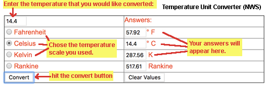 Instructions to use the Temperature Unit Converter. |
| The National Weather Service provides a handy Temperature Unit Converter website. Use the converter to convert ° Celsius to ° Fahrenheit. |
Question 56. What is the date on the map, and what is the water temperature in ° Fahrenheit? |
Go to the extended NWS Forecasts and Drought website. On the green menu, click on El Niño Anomaly Loop. |
| Sea surface temperature data is used for many purposes in oceanography. A major interest the global climatic effects of the El Niño/La Niña (El Niño-Southern Oscillation). The looping animation shows the last 6 months of the global sea surface temperature variations. Blue colors shows along the equator show that strong winds are causing cold water upwelling. Orange to red colors mean that the surface waters are warm and upwelling is diminished. |
Question 57. In the last 4 months, where has equatorial upwelling been the strongest, in the Atlantic Ocean or the Pacific Ocean? |
Go to the NOAA Tides & Currents website. |
| The NOAA Tides & Currents website was a wealth of information related to current and forecast tidal conditions for coastal locations anywhere in the United States including information about extreme tides and coastal flooding, and harmful algal blooms. Because tidal cycles are so predictable, it is possible to predict high and low tides on any day for centuries into the future! |
| On the Tide NOAA Tides & Currents website, click on Tide Predictions. Click on the link to California. Under the section on Southern California, click on La Jolla (Scripps Institution Wharf). |
Question 57. What is the current time and date, and what is the level of the tide in Height in feet (MLLW) [mean low-level water line]? |
| The La Jolla tidal current reference station is the closest station serving northern San Diego County. Tidal prediction for towns and locations along the coast in the North County are calculated from this station. When oceanography lab instructors in San Diego plan field trips to the beach, they need to look ahead to the next semester to see when the lowest tide will occur during their lab class periods. For example, if a class is on a Monday afternoons (1:30-4:00 pm), the instructor has to choose the best Monday in a month to go on a Monday PM field trip when the tide is the lowest. La Jolla Station tide prediction calculator the look ahead at the months of April or November to pick the best day for certain field trips, such as to look at tide pools or examine beach conditions each semester. |
Your task is to use La Jolla Tide Calendar Calculator to examine either April or November of the next semester to see which Monday of the month will have the lowest tide around 2:00 PM.
|
Question 58: On which Monday afternoon (around 2:00 PM) will the tide be the lowest? (next semester: April or November) |
Wave and Swell Information (current and forecast conditions)Getting information about wave and swell conditions is important for many reasons. Fisherman and sailors, surfers and beach-goers, and coastal business and residents all need this information to safely plan ahead. The website below provides wave and swell data anywhere in the world. You can look at maps for regional wave heights, swell wave heights, peak wave periods, wind speed direction and more. |
Go to the NOAA Wavewatch III (NWW3) website.Under the Choose a Region pull down menu, select US West Coast Zoom 2. This will bring you to a map of the California coastal region. |
| The default map view is "Significant Wave Height." The map's looping cycle is from 3 hours ago to 24 hours in the future. Note that the colored scale bar for wave height is in meters. Each of the little green, yellow, purple dots are buoys that record wave information used to create the maps. If you click on one, it brings up Buoy Information (you have to also select Buoy Info: choices to see data and colored charts). [Using the Product Viewer instructions are available if necessary.] |
| On the NWW3 Product Viewer web page for US West Coast Zoom 2 (California), watch the looping map view for Significant Wave Height and use the color bar options to see what the greatest wave height has occurred or is projected to occur on this day. |
Question 59. According to the colored scale bar, what was, is, or will be the greatest wave height (in meters) shown on the looping map for this day? |
| On the NWW3 Product Viewer web page for US West Coast Zoom 2 (California), click on the Peak Wave Period option. |
| This map view shows how the wave period changes through the day as well as the direction the swell is moving. Wave sets with longer periods move faster, and when combined with greater wave height, produce the largest cresting waves along the beaches. |
| Watch the looping map view for Peak Wave Period and use the color scale bar options to see what the longest wave period has occurred or is projected to occur on this day. |
Question 60. According to the colored scale bar, what was, is, or will be the longest wave period (in meters) shown on the looping map for this day? |
| On the NWW3 Product Viewer web page for US West Coast Zoom 2 (California), click on the Wind Speed and Direction option. |
| This map view shows how the wind speed and direction changes and is forecast to change over the next 5 days. Stronger winds create higher waves and increasing hazardous conditions for boats at sea or conditions along the coastline. Under the right circumstances, stronger winds can also increase coastal upwelling that can benefit productivity for sea life. |
| Watch the looping map view for Wave Speed and Direction and use the color scale bar (wind speed reported in knots) to see what the greatest has occurred or is projected to occur over this 5-day period. |
Question 61. According to the colored scale bar, what is the highest wind speed forecast on the looping map for this 5-day period? |
Go to the nowCOAST website.The full title is NOAA's Web Mapping Portal to Real-Time Coastal Observations, Forecasts, and Warnings. |
There is something about "saving the best for last."The nowCOAST web portal is comprehensive—it pretty much provides access to everything already presented in this lab, and more. It may be quite cumbersome at first, but for a trained user it is amazing to have all this information all in one place. You can imagine how a navigator on a merchant or Coast Guard ship would find this web portal incredibly useful. The exercise below illustrates just a few features that illustrate the power of this website and the amazing quantity of data that NOAA provides free to the public.The best way to navigate on this portal map is to move your mouse cursor to a location and left click to zoom in; right click to zoom out. Or, use the + / - zoom buttons. To move left-right, up-down hit the (NOTE! You may need to reload the website if things freeze or get out of whack). Hit the reload option on your web browser, and it will take you back to where you were. |
Use the map view buttons in the upper right corner of the map.
|
| The Layers Menu is on the right side of the map. It has many choices to choose from! If you click on any of the little white boxes it will activate that layer. Also note that little boxes with a ? or ▼may appear.
|
The Layer Menu has an abundance of links that will load a variety of map layers. Some are essential for ship and aircraft navigation. Some map of the same information that was provided in the discussions above. Types of map layers include:
|
| Time Control is located on the bottom. Use the Time control feature to start, stop, or repeat looping for the data layers you have selected! |
| OK! Time to try it out! Start by comparing weather satellite data with lightning strike density - this really shows where severe weather is really intense... |
| Start with a map view of North America. Under the Layers Menu, go to the Observations menu option. Under under the Observation menu, go to the Remotely-Sensed menu option, Under the Remotely-Sensed menu, click on the boxes to select:
If you see evidence lightning, zoom in on it, and click on the colors to see how many lighting strikes per minute are occurring in that area. Click on the image to the right to see instructions if you need them. |
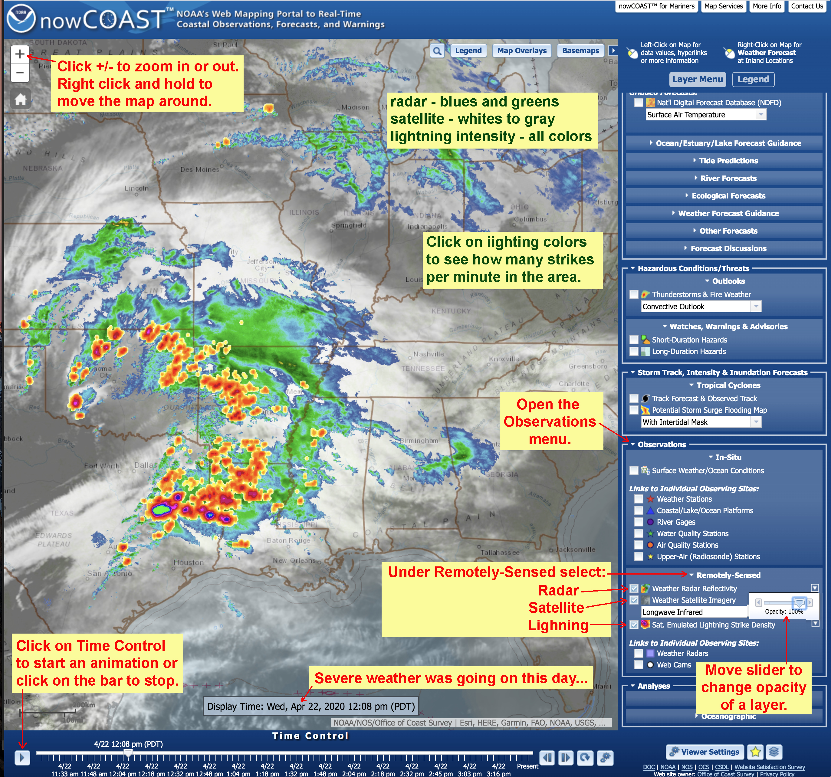 |
Question 62. Were you able to find lightning in a thunderstorm? Where, and how many strikes-per-minute? If not, based on the combination of radar and satellite imagery, describe where the most intense weather seemed to be occurring in the region. |
Now lets go back to San Diego County... |
| Note that
all the boxes you check on, stay on. Click on the boxes to turn the layers ON or OFF. |
|
Instructions to get to Observation Station data are illustrated below |
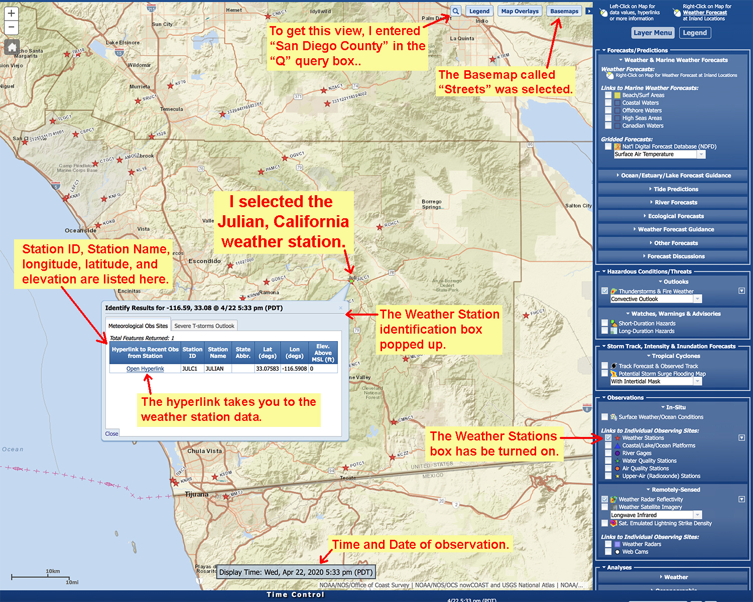
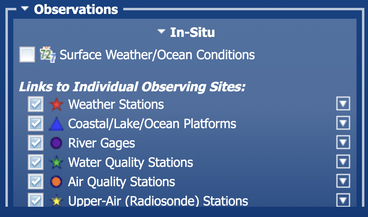

| Click on each box (layer) under the Links to Individual Observing Sites. Find the closest site to where you live by each category. Answer the questions below. |
Question 63. What is the general location where you live? (Name the town or general location—not your private residence,) Question 64. What is the Station ID and Station Name of the weather station nearest to the location you gave above in Question 63? Question 65. What is the Station ID and Station Name of the coastal/lake/ocean platform nearest to the location you gave above in Question 63? Question 66. What is the Station ID and Station Name of the river gauge nearest to the location you gave above in Question 63? Question 67. What is the Station ID and Station Name of the air quality nearest to the location you gave above in Question 63? |
Read the sections on "Local Weather/Climate Phenomena In Southern California"Sections 1-41 to 1-49 describe local weather phenomena that effect Southern California. |
Question 68. Of the different weather phenomena described in Sections 1-41 to 1-49, what are you experiencing where you live today? Before you do this...
|
One final question. |
Question 68. What did you think of this on-line lab? We need feedback to improve the quality of new online lab teaching material. Briefly describe what you liked, and otherwise. Both positive and critical comments are appreciated. |